Browse by Category

I’m thrilled to finally get to share the Showtime Rebrand I did at Gretel, which won a Bronze Clio Award. My role was co-Creative Director with Sue Murphy and Gretel ECD Ryan Moore. I was also lead copywriter and co-brand strategist with Jonny Meyer. My old friend Nina Goldberg managed the entire project masterfully. We had an amazing team of designers and animators that included Justin Au, Adam Lowe, John Choi, Cyrus Cumming, Johannes Geier, Eric Overton, Jonathan Correira, Lauren King and Alaijah Hampton, as well as my man Jens Mebes, who came on board to do some animation for us towards the finish. Sound design on the new mnemonic was done by the ever-amazing Antfood
It all began with lengthy group discussions with key brand stakeholders about the true meaning of Showtime. About their legacy as a challenger brand and their devotion to curation and pushing boundaries. Our core objectives from the outset were straight forward:
DEFINITION
Defining the signature assets, markers and behavior of the brand.
DIFFERENTIATION
Finding ways to show current and future viewers how the brand stands apart from competitors.
ATTRIBUTION
Sharpening how we link the content, titles and talent to the Showtime brand, no matter where it lives.
STREAMING FIRST
We needed them to shift their mindset – from that of a linear-first brand to a streaming-first brand. We needed to unify the motion, messaging and design behaviors across all platforms.
DISTINCTLY SHOWTIME
We determined that t was crucial to stay tethered to specific elements of their core DNA: An iconic logo and signature color palette. A modern, cinematic and luminous aesthetic.
COLLECTIVELY CONGRUENT
Remaining visually congruent with legacy assets was imperative., given the very real logistics of a digital library this deep. So, make a modern and brand new Showtime, but make it still feel like the old Showtime. An interesting challenge, for sure.
Spread across a collection of plexes, franchises and partnerships, we needed to shift brand perception back the notion of ONE Showtime. One consumer experience. So we streamlined naming, attribution and destination messaging – to create consistency throughout the brand ecosystem and touchpoints.
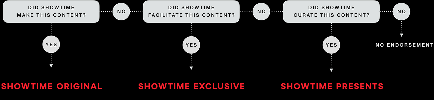
A big part of this exercise was reducing the number of ways content can be attributed to the brand. We landed on some very simple rules that proved invaluable in creating strong consistency in all marketing materials, moving forward.
THE BIG IDEA
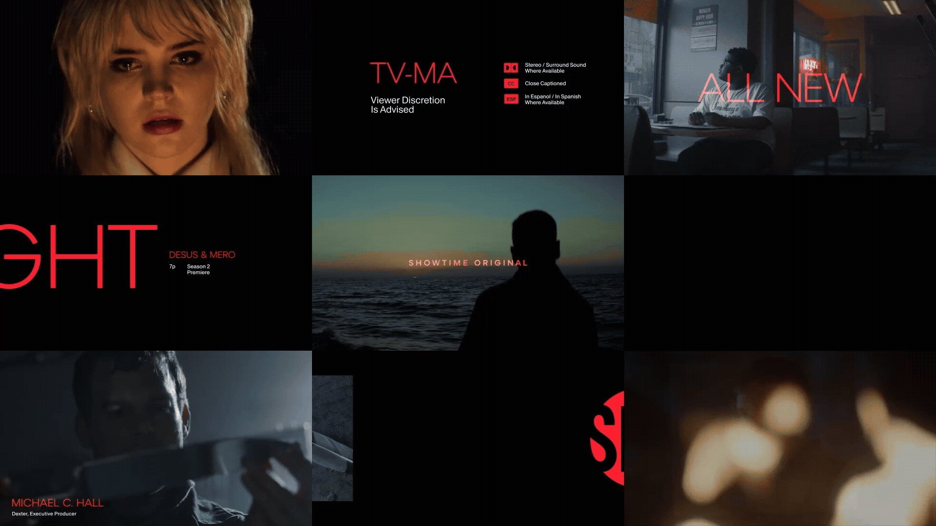
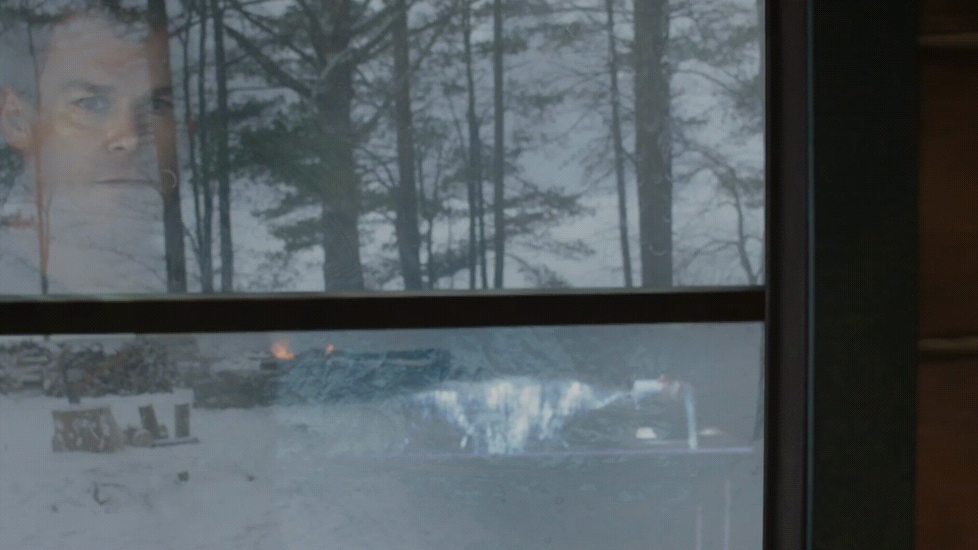
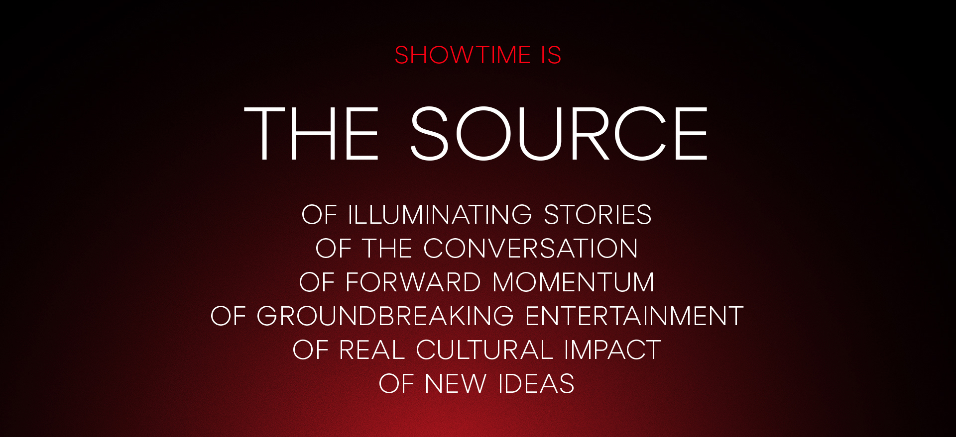
Great branding starts with a great idea. A creative platform that can inspire and inform every execution moving forward. We landed on a concept that could both speak to the cultural impact of the brand and leverage the cinematic luminosity that’s always been an integral part of their visual DNA. We call it THE SOURCE.

THE SOURCE ILLUMINATES
New stories, new characters, new creators and their work.
THE SOURCE LEAVES AN IMPRESSION
Our shows and characters stay with you. They make an impression, for viewers and for culture at large.
THE SOURCE IS A BEACON
It flashes, alerting viewers that the show is about to begin.
THE SOURCE IGNITES A CHAIN REACTION
It incites and inspires new stories, characters and creators.

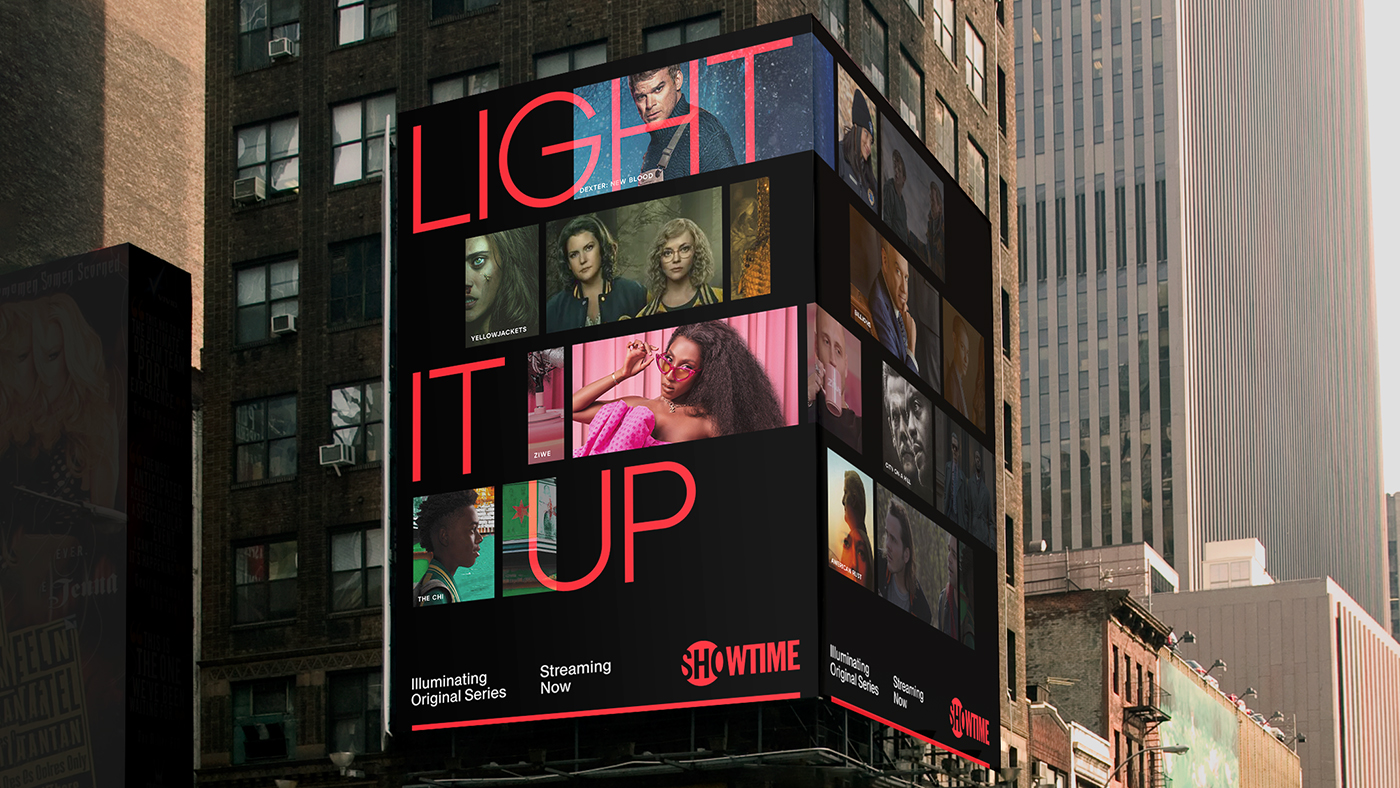
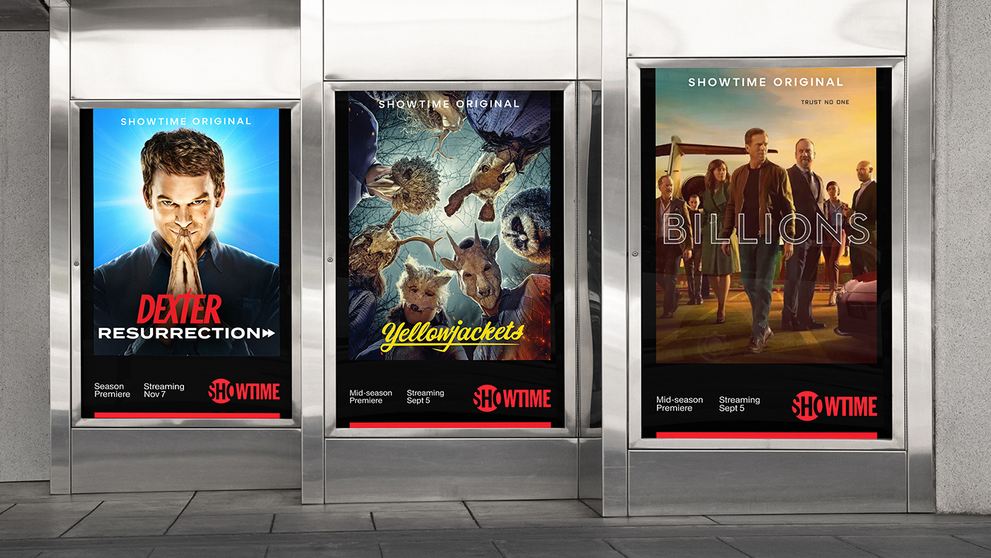
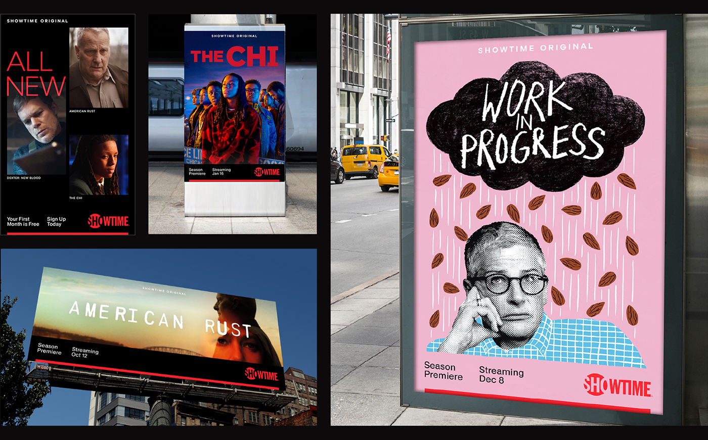
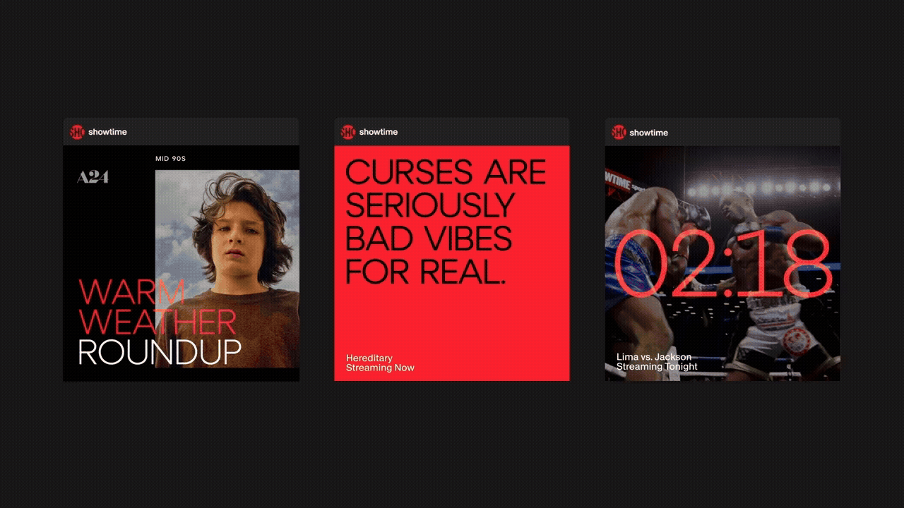
To add more tools to the toolbox, we developed a graphic device called the SLIPSTREAM – a series of shapes, born directly from the letterforms of the Showtime logo, that share some DNA with film strips and library carousels. It let us re-frame and shift focus from the portfolio down into a single show, character or moment. It became a graphic element to use as a framework for key art, employing the red bar to hint at a deeper library of content, just out of frame, waiting to be discovered.
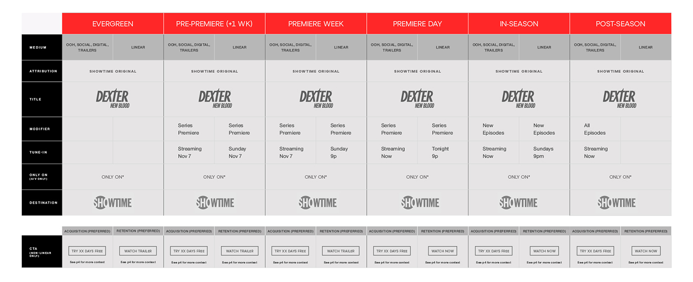
I did a full audit of their current brand messaging, across all touchpoints – with the ultimate goal being less variables, more consistency and more clarity. This yielded an entire deck of these hyper-specific messaging matrices, which provided strict guidelines for messaging over the entire promotional life cycle of a show title. But not all content is alike. There is very specific language for a brand new series VS a returning series VS a one-off event. Each type of content needed its own Matrix, and its own set of wireframes assets
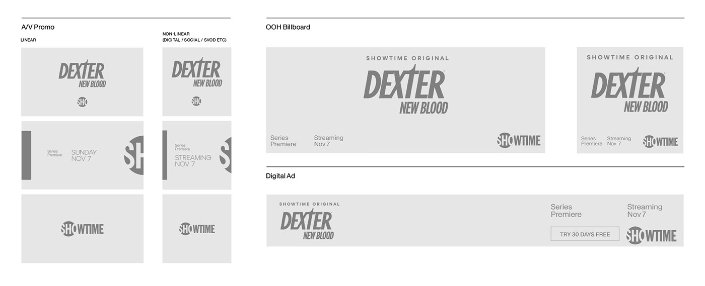
We created exhaustively thorough templates for any and every iteration of content promotion, with strict guardrails around attribution, logo placement and usage, and tune-in nomenclature. We did this for every category of content from originals to acquisitions and co-branded events.