SHOWTIME REBRAND
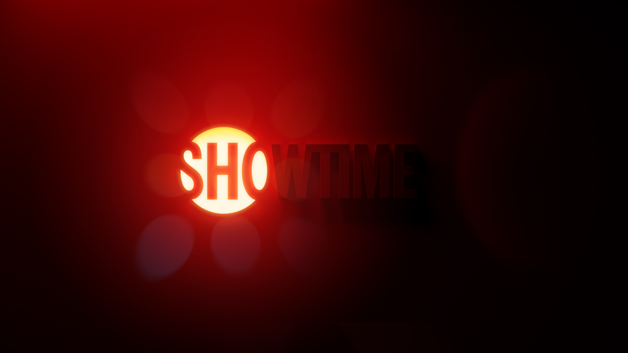
I’m thrilled to finally get to share the Bronze Clio Award-winning Gretel rebrand for Showtime. My role was co-Creative Director with Sue Murphy and Gretel ECD Ryan Moore. I was also lead copywriter and co-brand strategist with Jonny Meyer. My old friend Nina Goldberg managed the entire project masterfully. We had an amazing team of designers and animators that included Justin Au, Adam Lowe, John Choi, Cyrus Cumming, Johannes Geier, Eric Overton, Jonathan Correira, Lauren King and Alaijah Hampton, as well as my man Jens Mebes, who came on board to do some animation for us towards the finish. Sound design on the new mnemonic was done by the ever-amazing Antfood
Rather than just show you a few movies and stills from the job, this time I’d like to dig a little deeper, and break down some key conceptual pieces of the rebrand.
It all began with lengthy group discussions with key brand stakeholders about the true meaning of Showtime. About their legacy as a challenger brand. Their devotion to curation and pushing boundaries. What they have always stood for and continue to strive for. And lastly, the opportunity they can now seize – as the last man standing among the exclusive club of tier 1, content-creator networks who have yet to dive head-first into aggregation.
Our core objectives from the outset were straight forward:
DEFINITION
Defining the signature assets, markers and behavior of the brand.
DIFFERENTIATION
Finding ways to show current and future viewers how the brand stands apart from competitors.
ATTRIBUTION
Sharpening how we link the content, titles and talent to the Showtime brand, no matter where it lives.
STREAMING FIRST
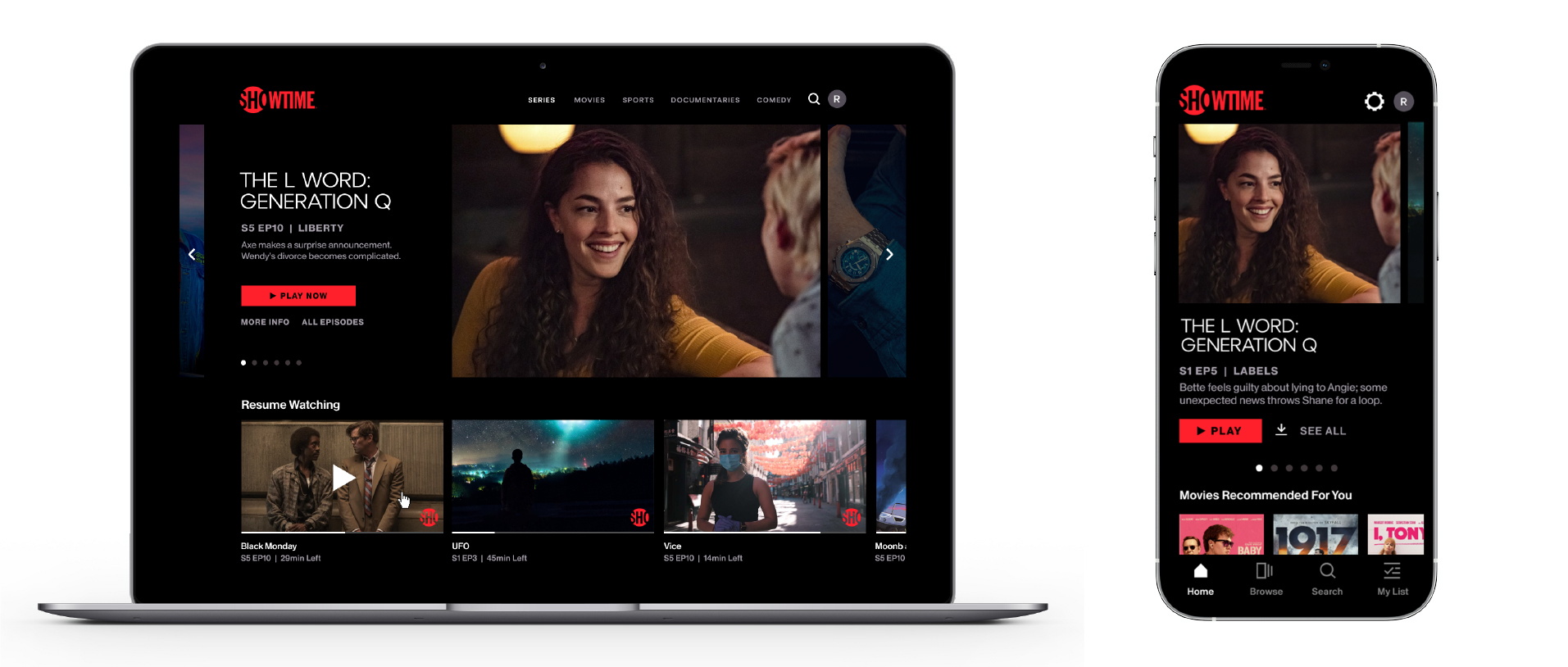
Though Showtime retains a large collection of linear channels left over from the cable TV land grabs of the 80s and 90s, we needed them to shift their mindset – from that of a linear-first brand to a streaming-first brand. It’s not that they weren’t already streaming. It’s that they still had a few old habits and messaging practices that needed an update. We needed to unify the motion, messaging and design behaviors across all platforms.
DISTINCTLY SHOWTIME
While everybody was on board with this future-forward approach, it remained equally important to the stakeholders that we stay tethered to specific elements of their core DNA: An iconic logo and signature color palette, and a modern, cinematic and luminous aesthetic.
COLLECTIVELY CONGRUENT
This connective directive was not simply about retaining legacy brand identity. It was also about the very real logistics of a digital library this deep. Any brand new visual materials that we created still needed to coexist alongside older material that remains on a myriad of channels and streaming platforms. So, make it modern and brand new, but make it congruent with the old. An interesting challenge, for sure.
ARCHITECTURE
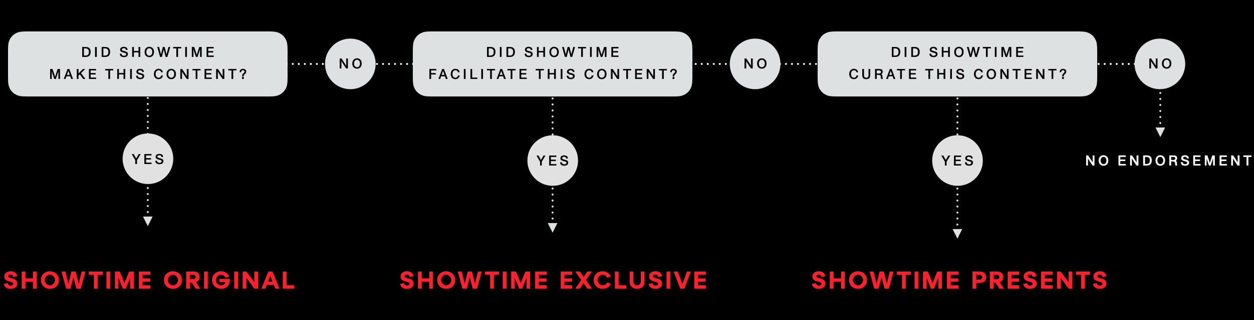
We did months of work dissecting the current state of their brand. We identified issues around perception that invariably arise when a brand is spread across a collection of plexes, franchises and partnerships. We felt it was important to shift brand perception back the notion of ONE Showtime. One consumer experience. This is why we streamlined naming, attribution and destination messaging – to create consistency throughout the brand ecosystem and touchpoints.
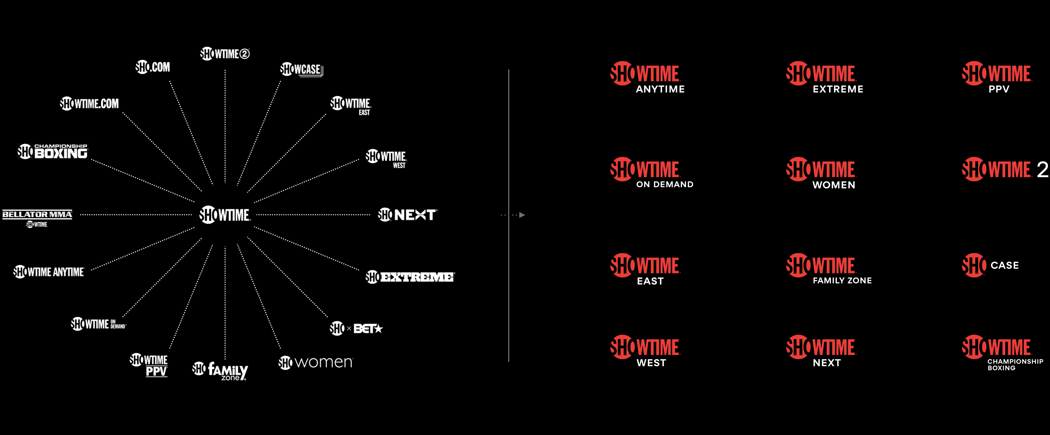
ATTRIBUTION
A big part of this exercise was reducing the number of ways content can be attributed to the brand. We landed on some very simple rules that proved invaluable in creating strong consistency in all marketing materials, moving forward.
THE BIG IDEA
Great branding starts with a great idea. A creative platform that can inspire and inform every execution moving forward. We explored several conceptual platforms for a number of weeks, eventually settling on an idea that could both speak to the cultural impact of the brand, and leverage the cinematic luminosity that’s always been an integral part of Showtime’s visual DNA. We call it THE SOURCE.
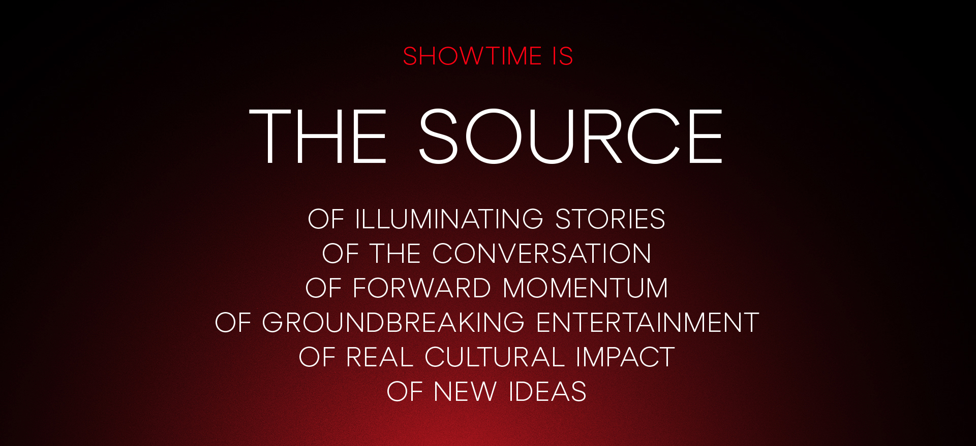
THE SOURCE ILLUMINATES
New stories, new characters, new creators and their work.
THE SOURCE LEAVES AN IMPRESSION
Our shows and characters stay with you. They make an impression, for viewers and for culture at large.
THE SOURCE IS A BEACON
It flashes, alerting viewers that the show is about to begin.
THE SOURCE IGNITES A CHAIN REACTION
It incites and inspires new stories, characters and creators.
SHOWCASING CURATION


MOTION LANGUAGE
The slipstream proved to be a great device to showcase the content, and serve as a visual representation of curation – a core part of the brand DNA. We developed multiple ways that animators and editors could leverage the slipstream to keep viewers engaged.

BRAND VOLUME
In the interest of stronger brand attribution, we developed clear guidelines to differentiate the show brand from the mother brand. Our promo system has a robust set of tools that can be used with great restraint for low brand volume, or with wild abandon for high brand volume.
Series trailers are better suited for low volume, to let the content shine.
Sizzles and combo promos are a great place for high volume, to bring the mother brand forward and increase attribution.
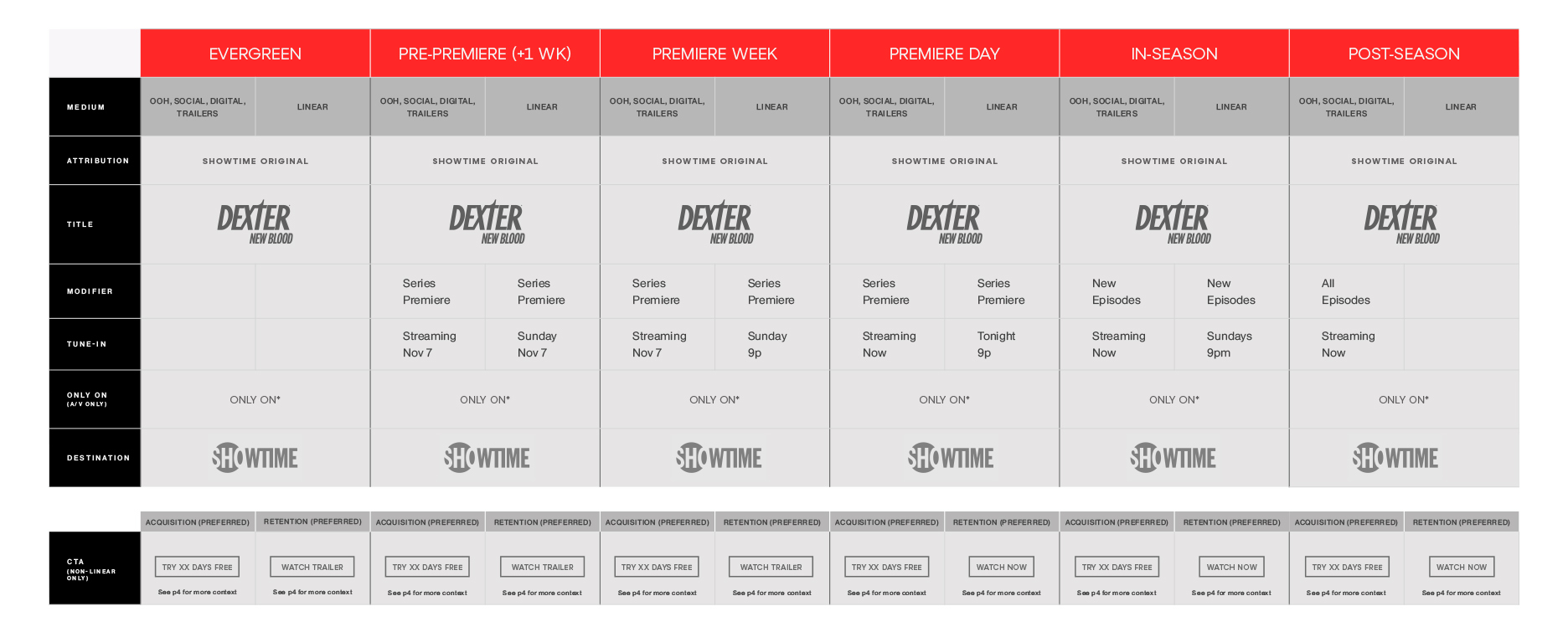
MESSAGING MATRIX
I did a full audit of their current brand messaging, across all touchpoints – with the ultimate goal being less variables, more consistency and more clarity. This yielded an entire deck of these hyper-specific messaging matrices, which provided strict guidelines for messaging over the entire promotional life cycle of a show title. But not all content is alike. There is very specific language for a brand new series VS a returning series VS a one-off event. Each type of content needed its own Matrix, and its own set of wireframes assets.
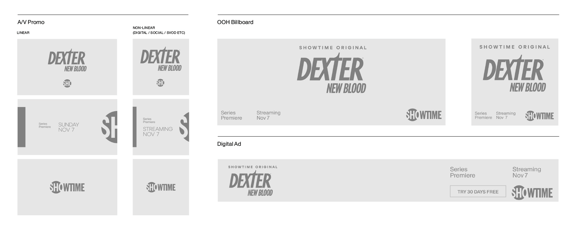
A FEW MORE FRAMES
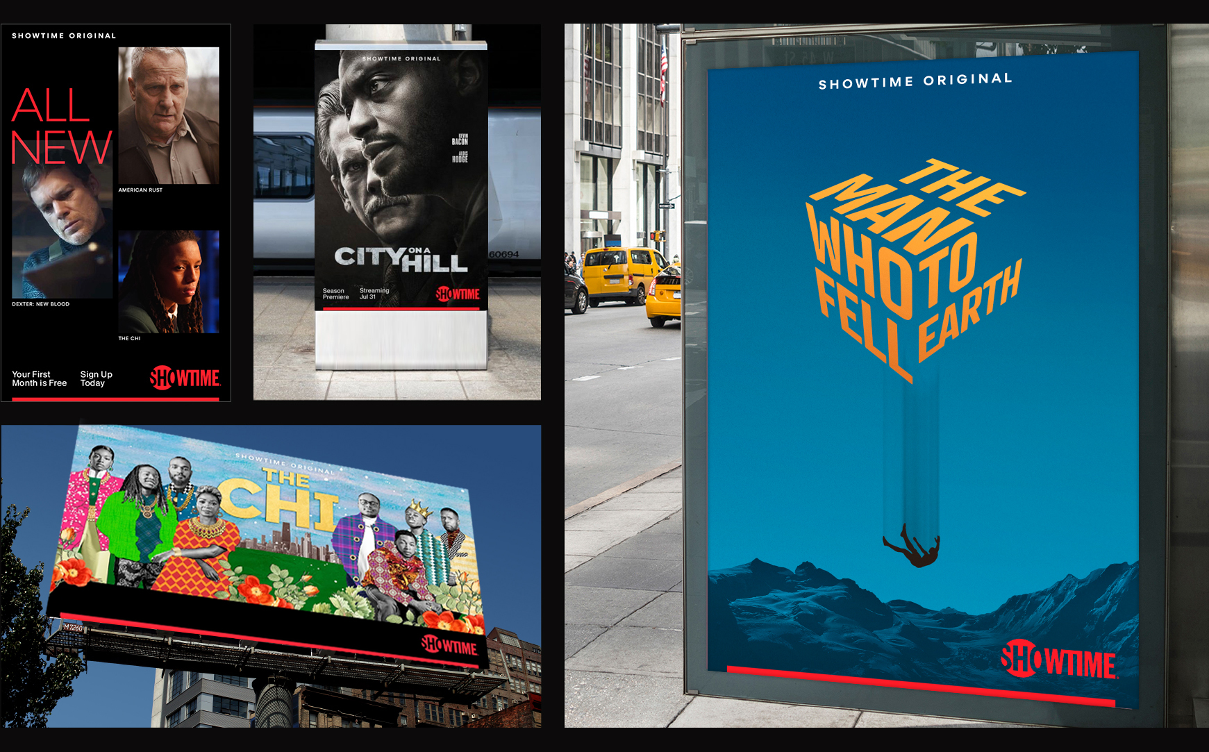
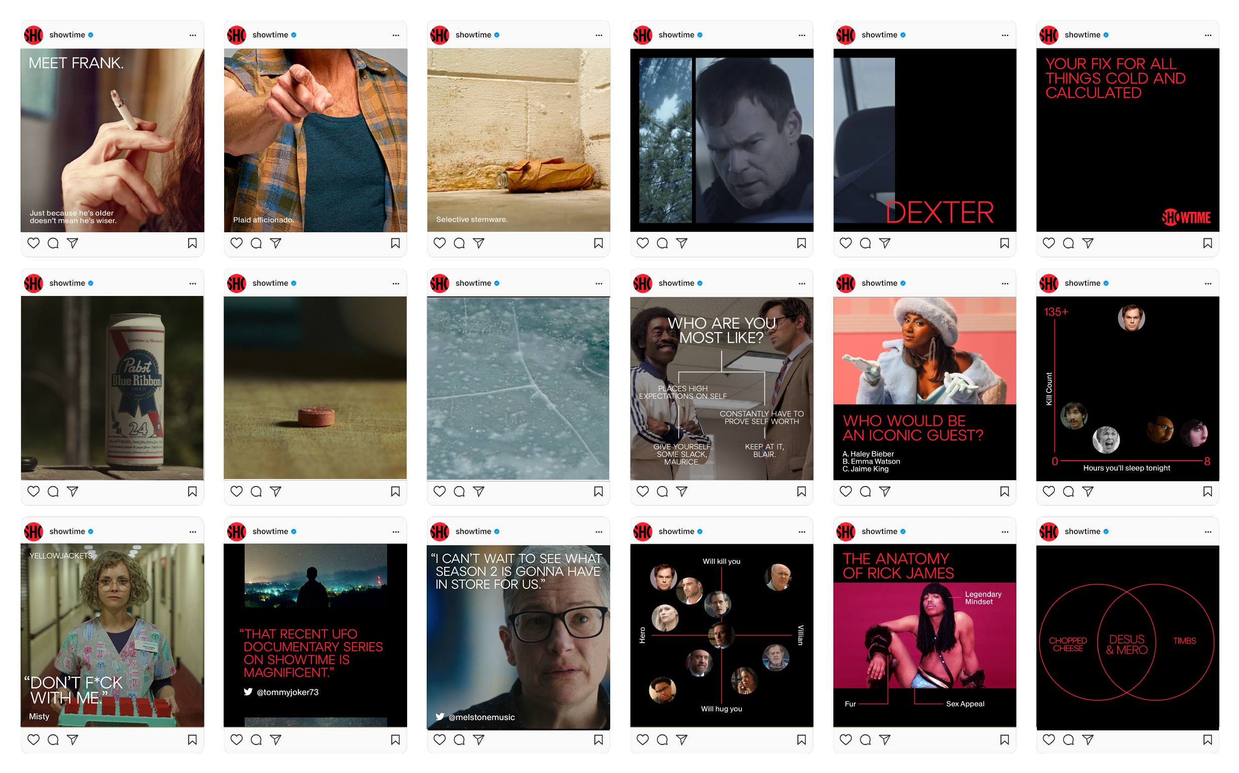
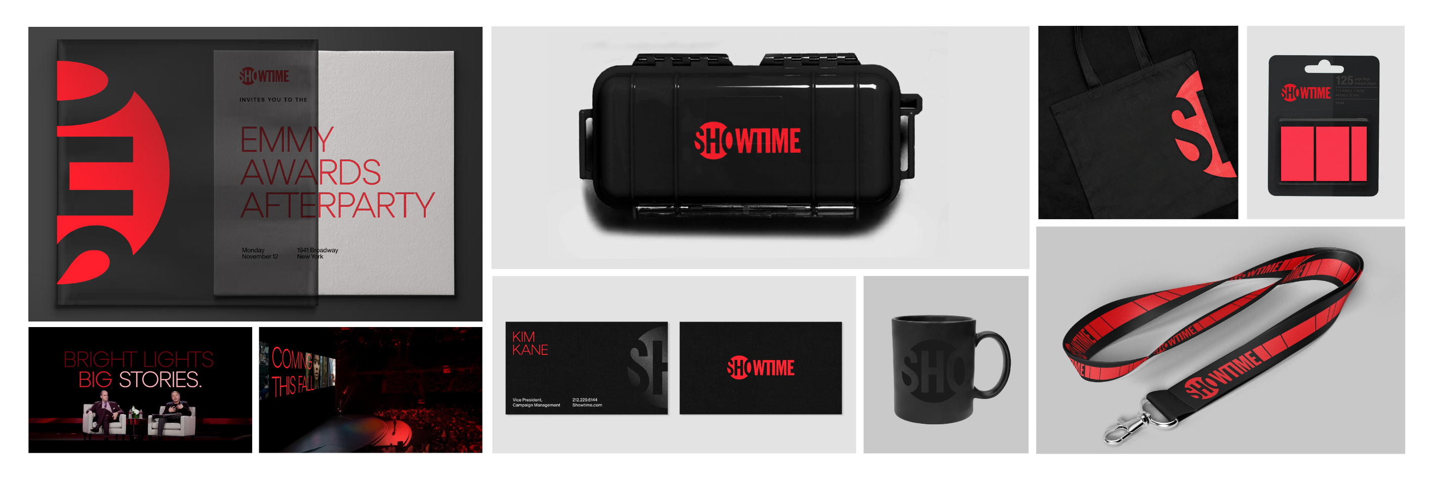
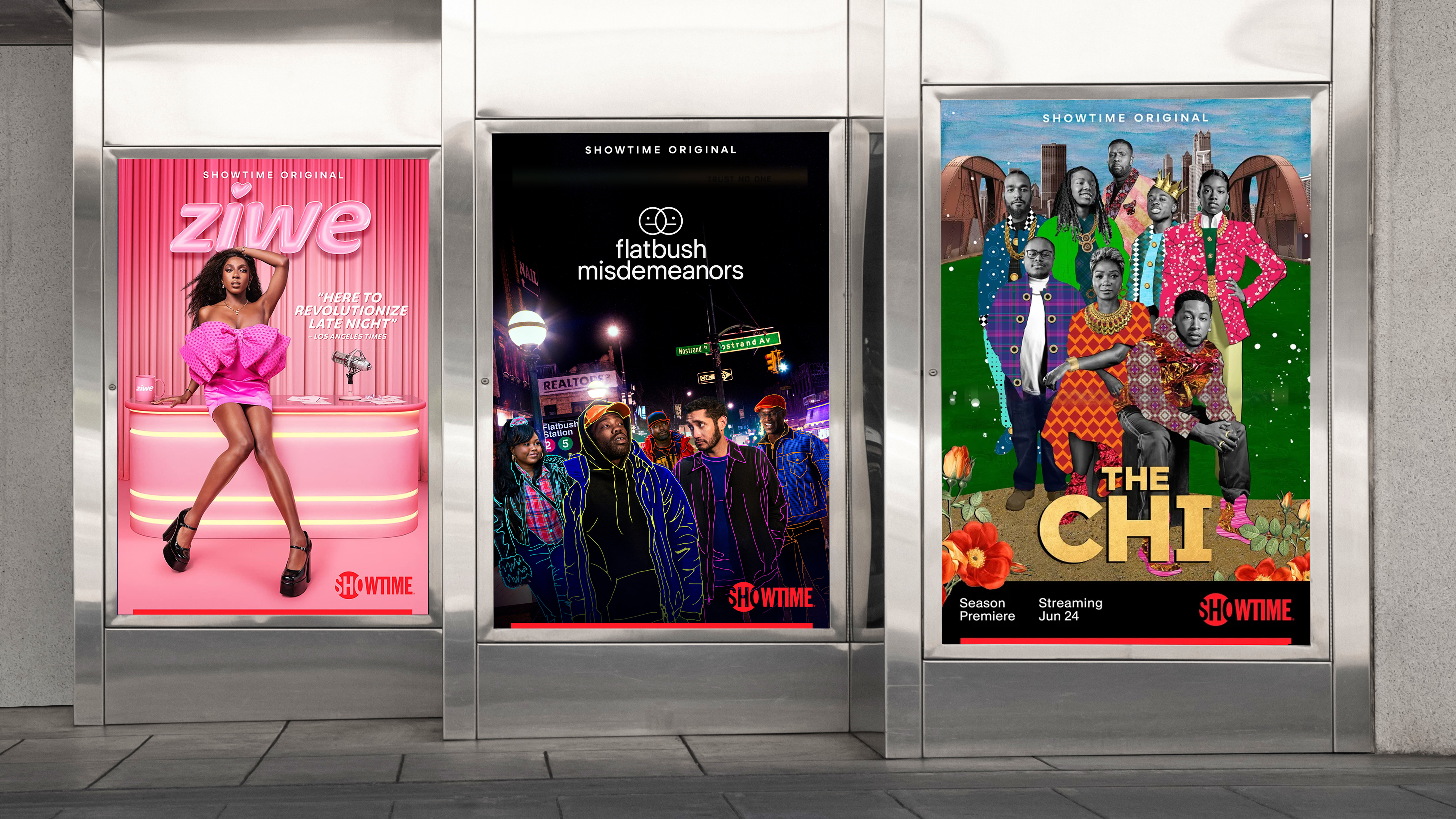
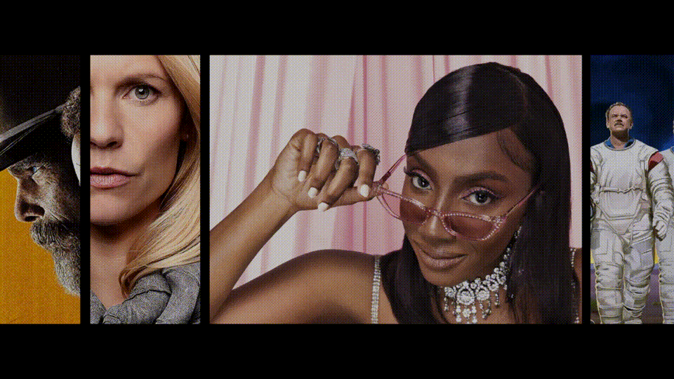
The deliverables for this job were comprehensive and exhausting, but we really covered everything. On air. OOH. Digital. Social. Identity. Comms. Email marketing. Partner Marketing. You name it. Here’s a few more frames for good measure.