COMEDY CENTRAL 2005
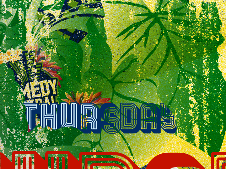
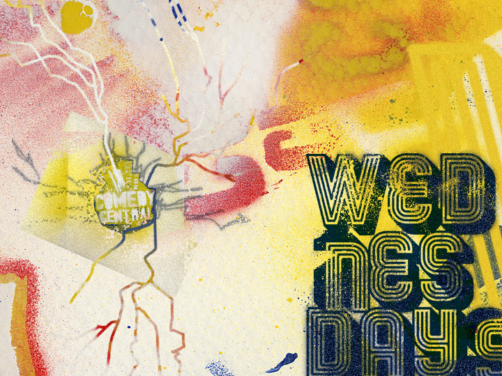
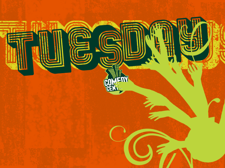
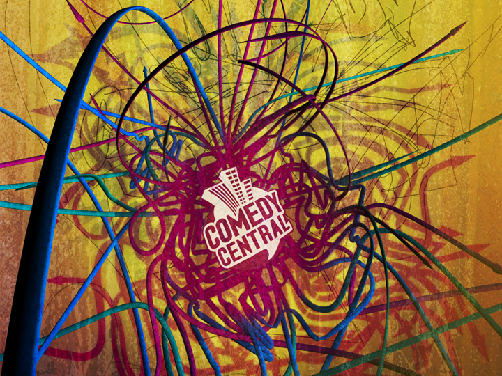
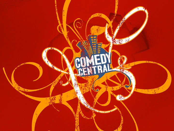
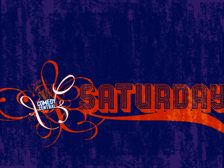
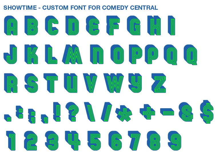
Way back in 2005 EyeballNYC contributed to the redesign of Comedy Central. These were some of the initial frames I designed to get things going. I also designed the typeface that was used on air. This was just too old to put on the main creative page, but I kinda like it, so I leave it here.



The good: Heroes season 1 filnlay came in at the library after putting it on hold in April. Had completely forgotten about it, so that was exciting!The not so good: I've been sickish and miserable all week.The best: Hmm, don't think anything could quite trump yours. Sounds pretty good to me.