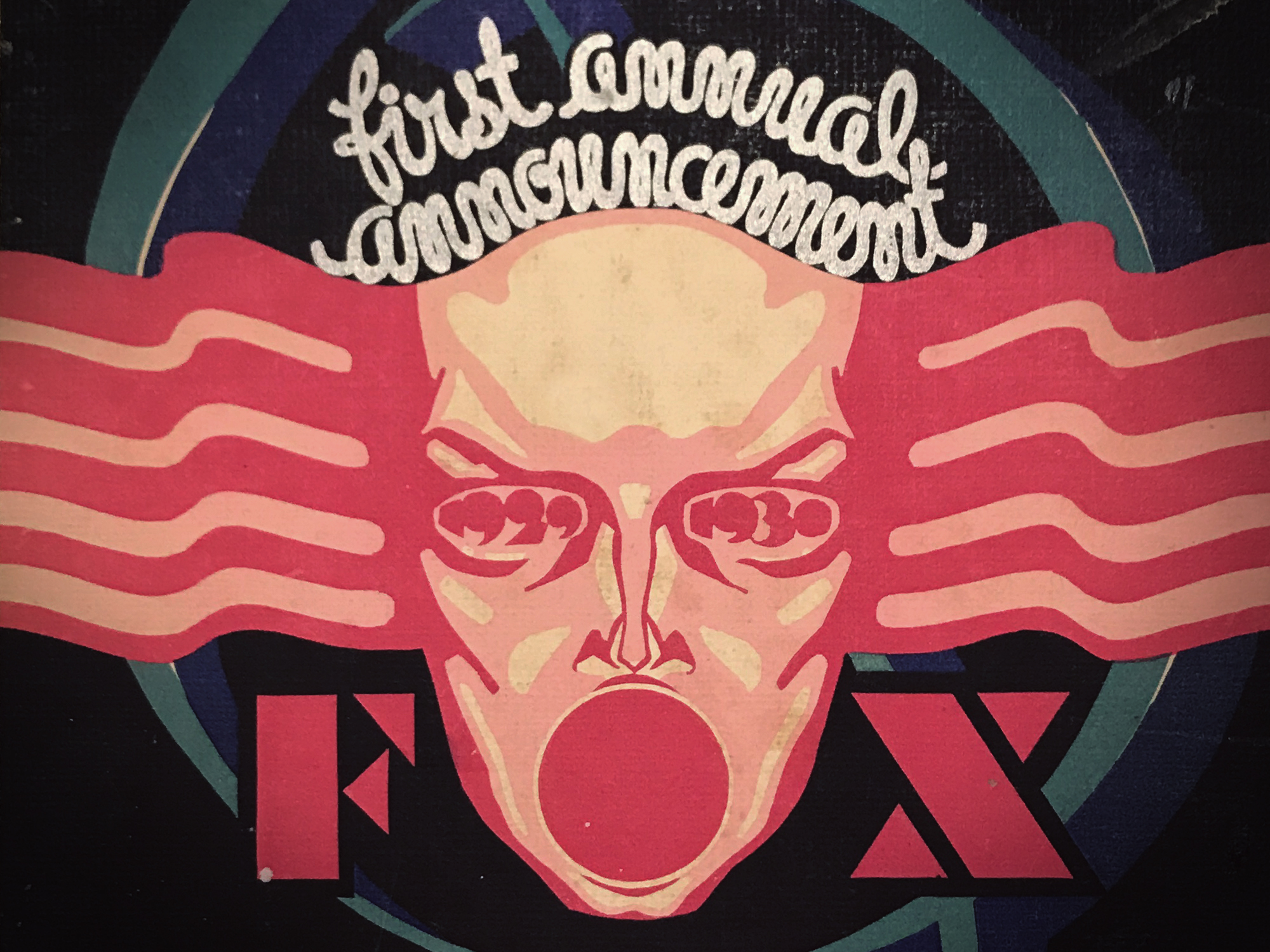
21ST CENTURY FOX: BRANDING & INTERIORS
DEFINING A GLOBAL MEDIA BRAND
I spent the vast majority of 2017 working with Gretel on the 21st Century Fox (21CF) brand, office interiors and gallery installation. What started out as a potentially ethically-challenging corporate branding job slowly turned into the dream job of a lifetime. When they first approached Gretel in January, 21CF had little more than a logo and one of the largest media empires on earth. By year’s end they had a complete and robust brand identity, a shiny new branded office space, and a 170-piece gallery installation. I worked intensely on the brand for the first six months, then transitioned to focusing my full attention on the office space and gallery installation.
It began like most branding jobs, with a great deal of research and discovery. Though we were given direct access to a few key stakeholders in both NY and LA, we quickly learned that scheduling time with media moguls like James Murdoch would prove challenging (our first meeting took six weeks to book and lasted nine minutes!). To our delight, James turned out to be a great client to work with. He is intensely engaged in every creative touchpoint of the company – from logos and typefaces to couches and color schemes.
Over the course of a few months, the Gretel team and I produced a series of very in-depth branding decks, focusing in on what 21CF was all about, and more importantly, where they were headed. The details of these decks, unfortunately, are a key ingredient of Gretel’s secret sauce, which I am not at liberty to divulge.

Six months in, we had gotten sign-off on essential brand DNA: A platform and tagline to hang everything on: “Together, we’re 21st Century Fox”. We articulated the brand personality and voice through a manifesto and anthem script. We defined the brand attributes and cultural threads that connected the different arms of the company. And finally, Ryan and team developed a smart, flexible visual identity system to build upon.
BRAND MANIFESTO
BRAND ANTHEM
Our business is built on the same foundation: an eclectic mix of individuals with a unique depth of character, drive and spark.
We come from different places, belong to different tribes, and we’re all on our own path. Following our gut, not following an algorithm. Looking for truth and meaning, not just chasing ratings. Seeing how things could be, not just settling for the way they are.
We encourage individuality. We embrace difference. We follow our hearts, we stick our necks out, and we stand behind each other, win or lose.
It’s this rich patchwork, the mix of different voices and the collision of different points of view that keeps us vital, fertile, thriving. It sparks new ideas and ambitions that pull us forward. And it’s that very same mix that makes our company, our brands, and our stories the best in the world.
Together,
We’re 21st Century Fox.
We go to bat.
For the oddballs and the outliers,
the wild cards and the geniuses,
the misfits and the visionaries.
We’re global sensations,
and local favorites.
Breakout hits and slow-burners.
Big bets and long shots.
We’re risk takers and voyagers,
going the distance against the impossibles, the not-gonna-happens,
and the oh-I-wouldn’t-if-I-were-yous.
and stick our neck out.
We don’t believe in good enough.
We never have.
And we back each other, win or lose.
We come from different places, belong to different tribes.
While we’re each cutting our own path, we know we’re on this road together.
Different makes us stronger.
Different voices,
and different points of view.
Shaking it up,
sparking new ideas
and driving us forward.
Together,
We’re 21st Century Fox.
AN APOTHECARY OF STORIES
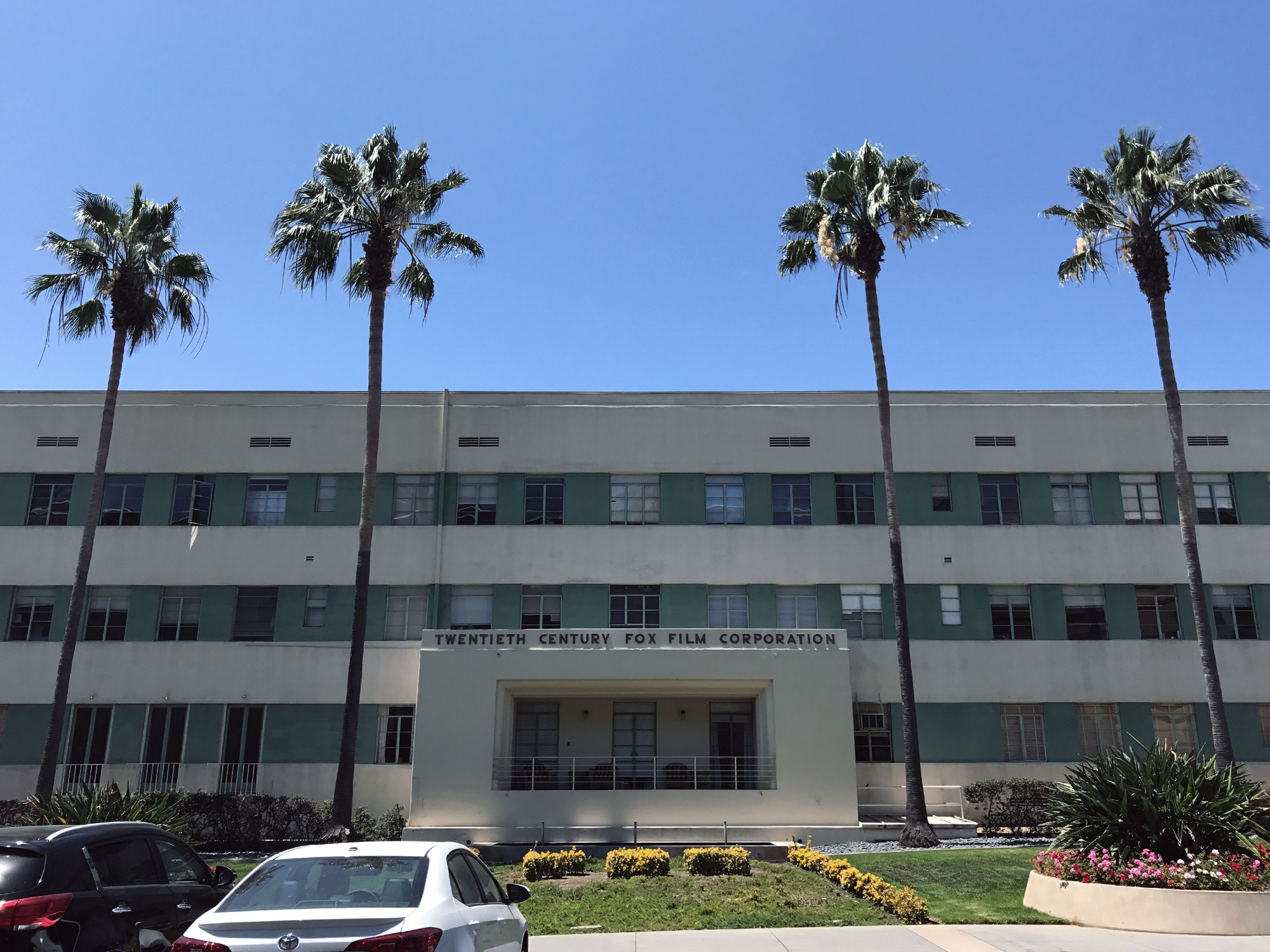
As part of our initial presentation, we proposed different ways that the new brand could be expressed. One of those proposals was a permanent gallery installation in their new corporate space – the top 3 floors of the Newscorp skyscraper on 48th & 6th. It was to be “an apothecary of all things 21CF.”
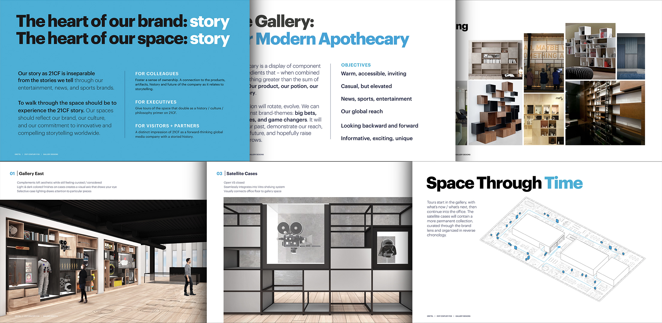
Not only did they love the idea, but I was awarded the job of designing and curating the installation. I was given carte blanche to mine the archives of 20th Century Fox, FX, National Geographic, The Simpsons, and all of the different brands. As a life-long movie and TV nerd who had already seen and committed to memory just about piece of content in their portfolio, I had seemingly found my calling.
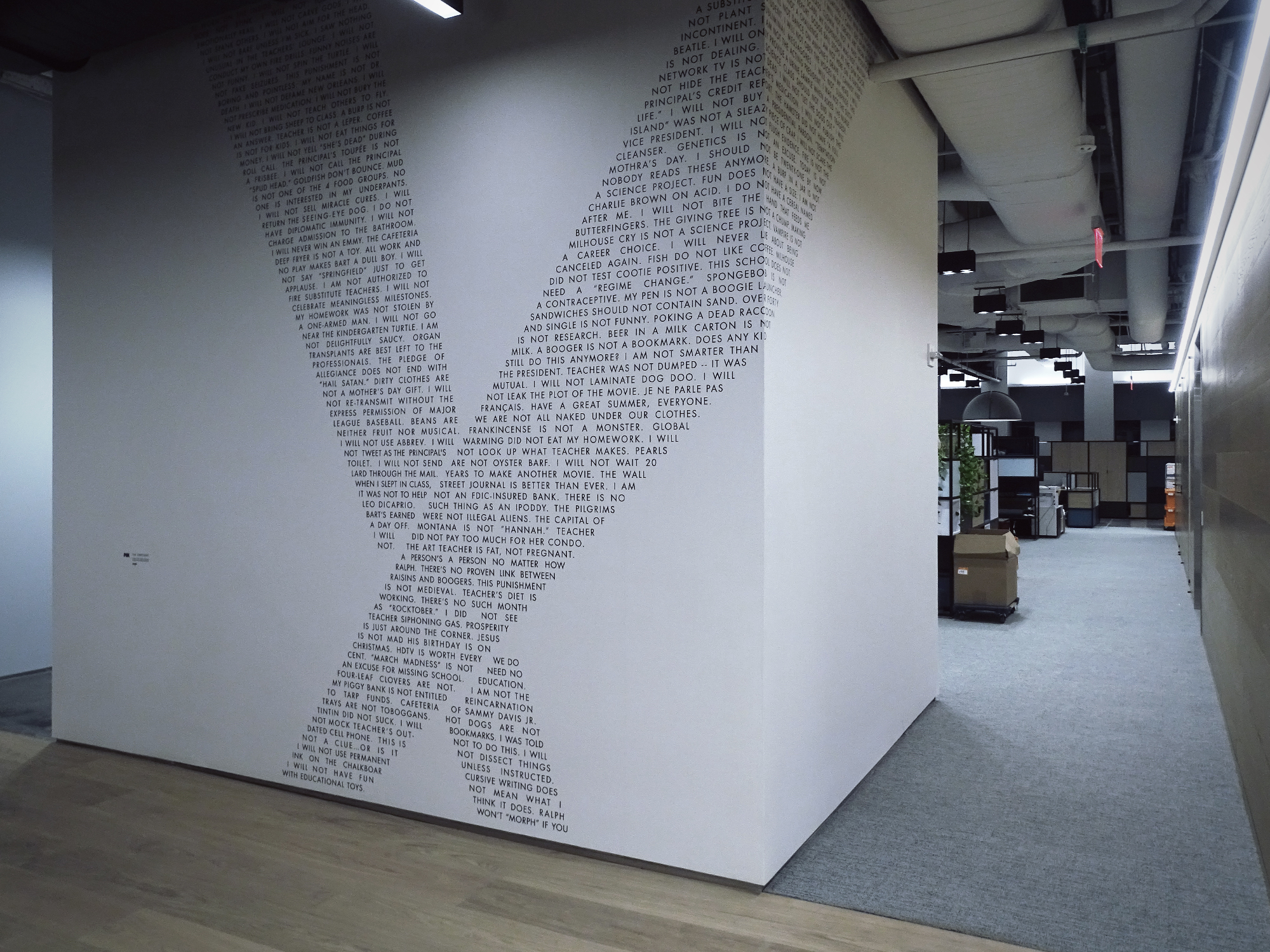
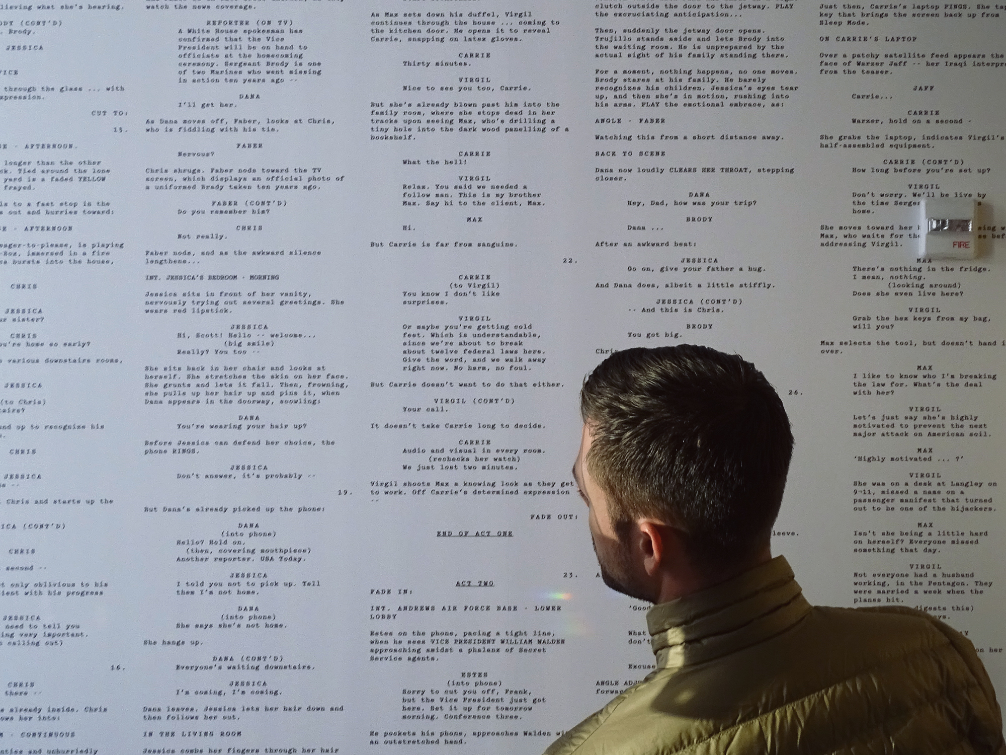
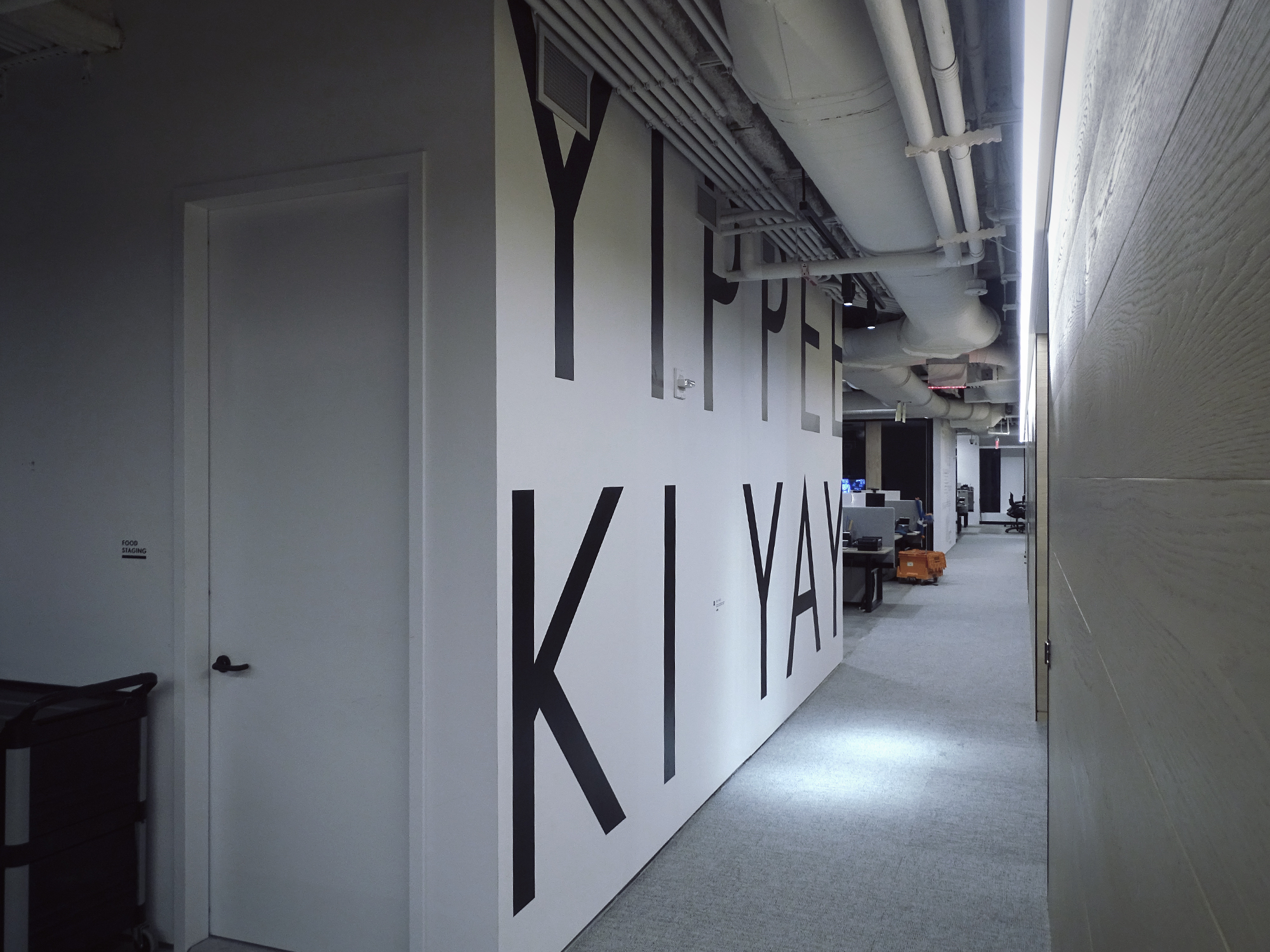
Pivoting off the searchlight-centric brand identity that Ryan and team had developed, a type-driven graphic system for branding the walls of the space was approved. I was tasked with pulling script quotes and data from all eras of their content. Again, as a guy with a head full of random quotes from films, TV shows and (especially) The Simpsons, I had seemingly found my calling.
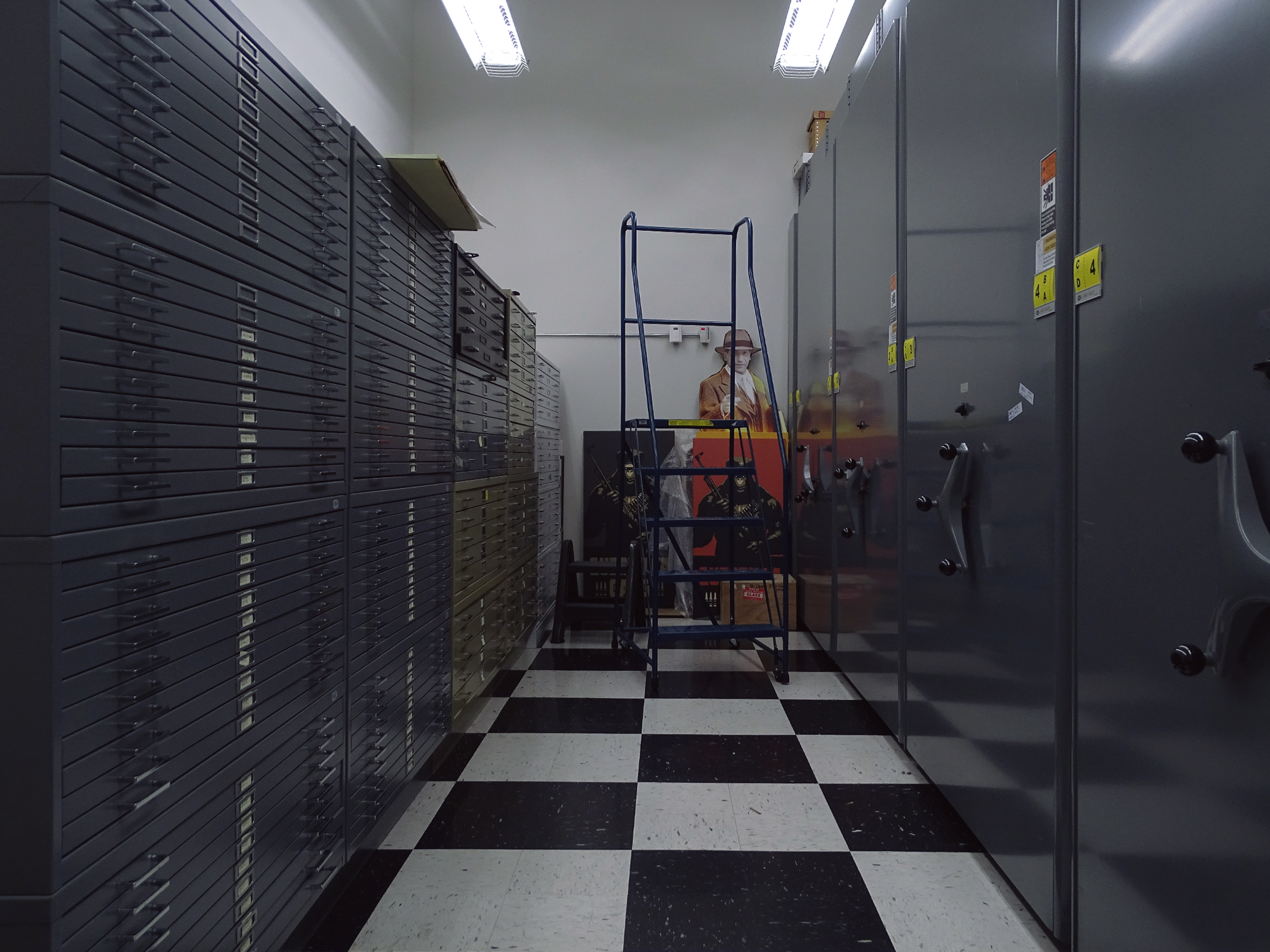
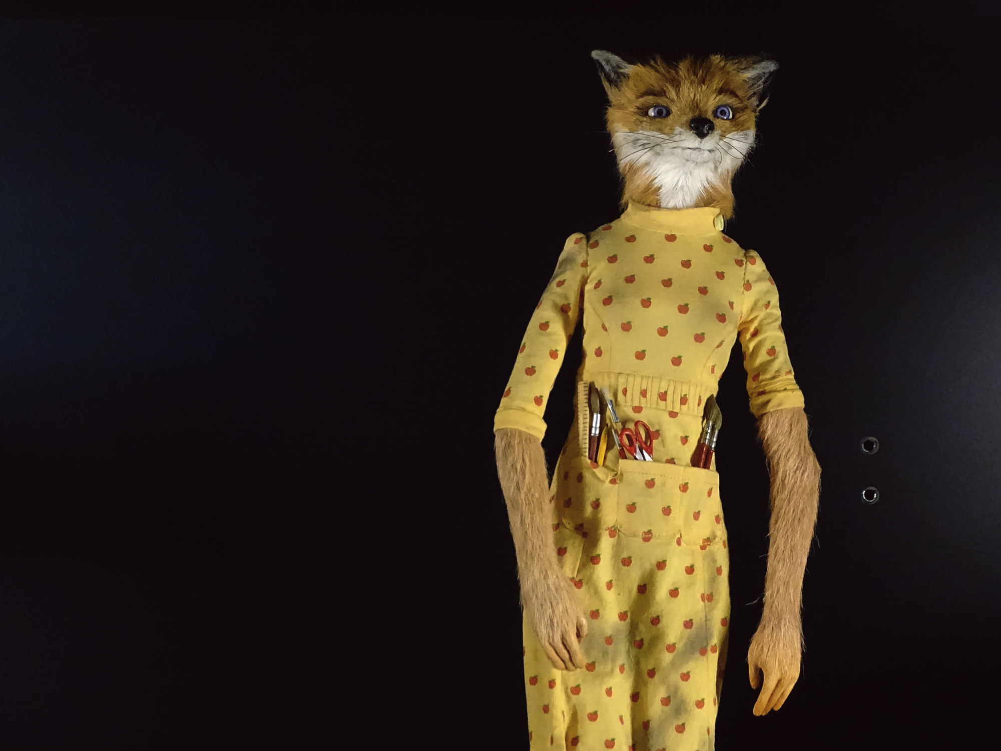
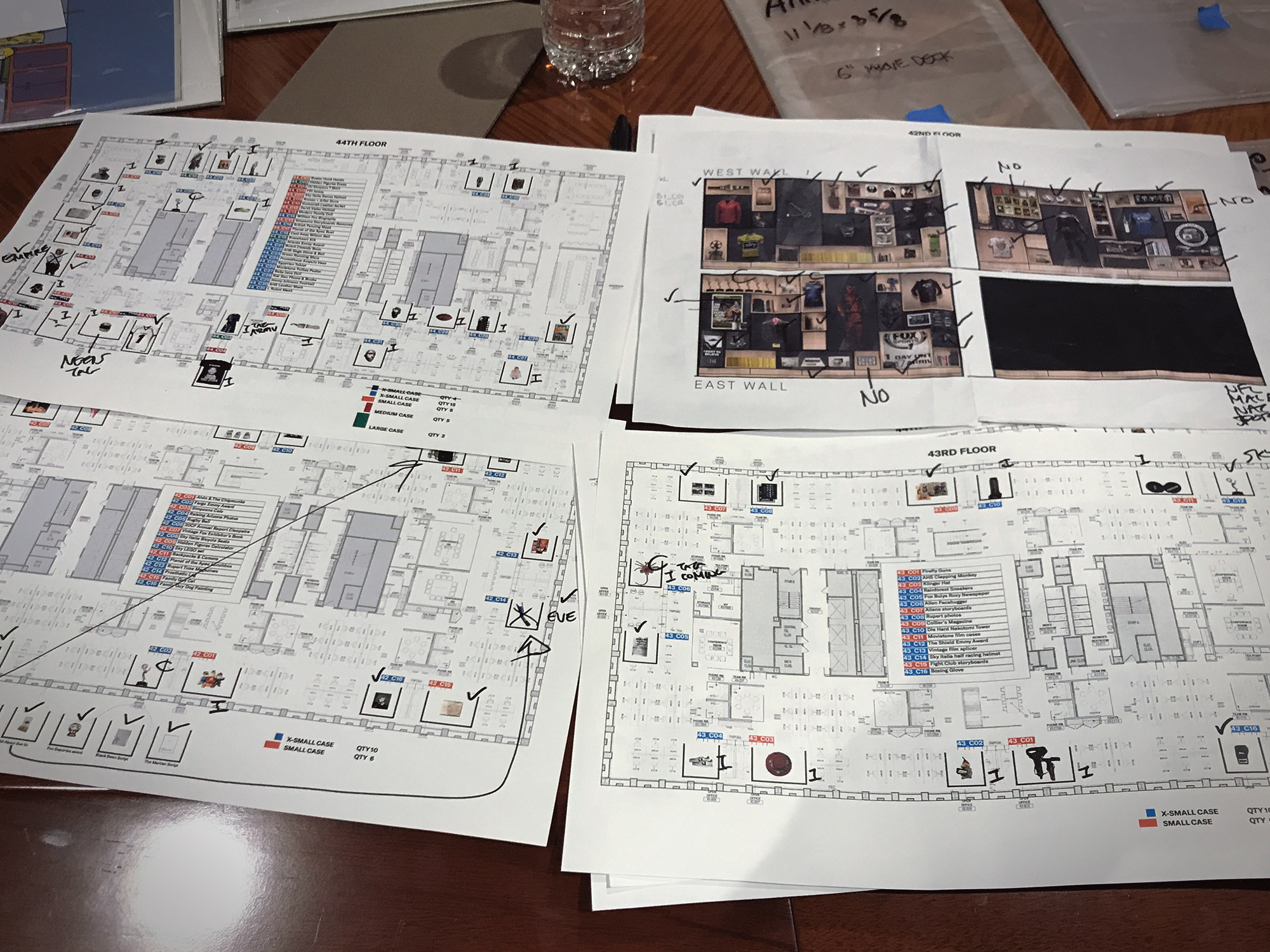
I spent the next 6 months digging around in the archives of the various 21CF brands, hand picking items for the installation and building decks to present up the ladder. When I was back in the office, I was researching film and TV screenplays and anecdotes to give the designers content to work with for the walls. I also had to write captions for all of the 170+ items in the gallery. I curated the installation around the theme of storytelling – as it really is the heart and soul of the brand. Below are some photo selects from the installation and the space, with some process stuff mixed in. If you’re a fan of movies, you will see why this really was a dream job for me.
![]()
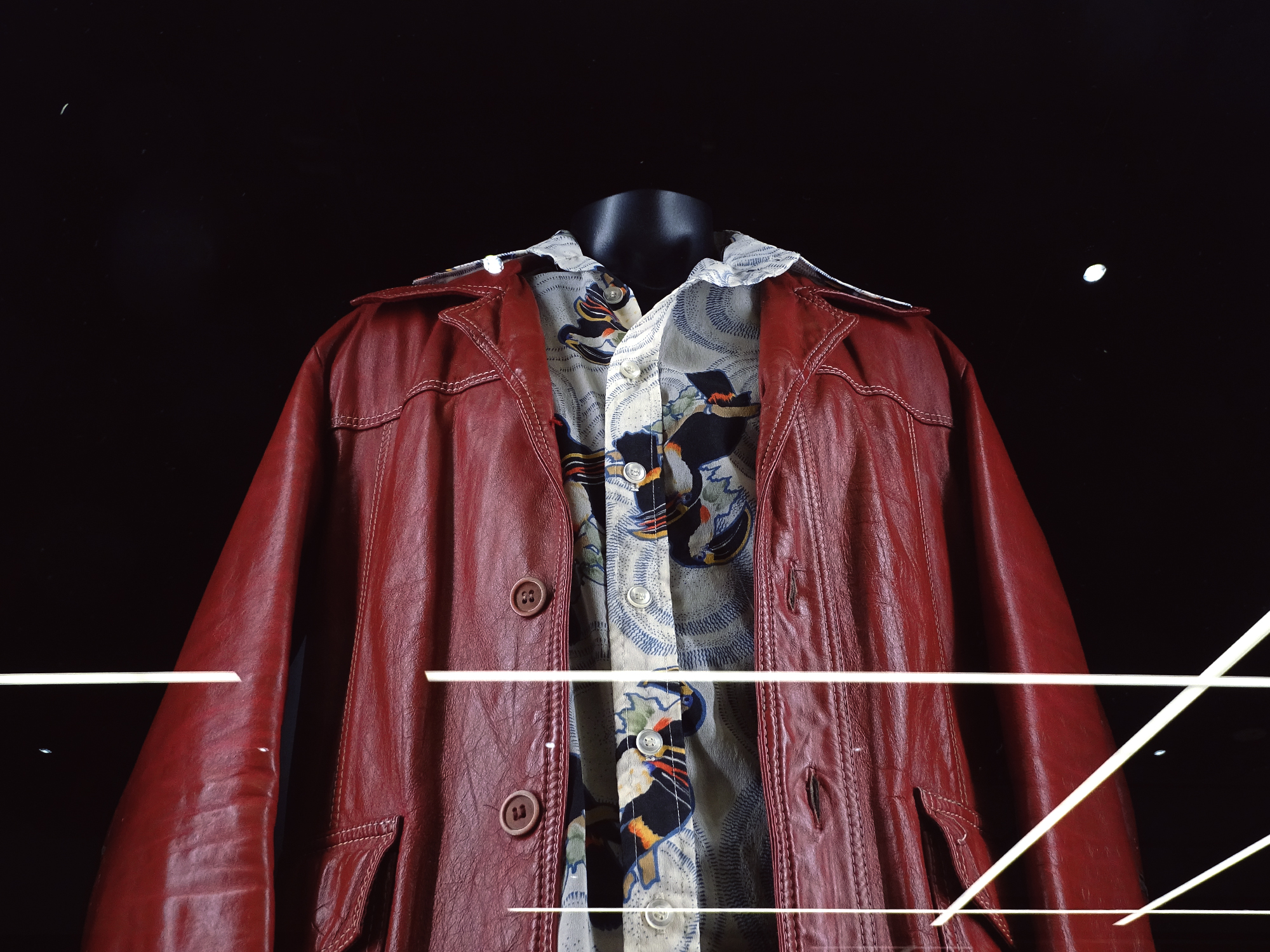
For Brad Pitt’s signature look in Fight Club (1999), costume designer Michael Kaplan was faced with the impossible challenge of needing 12 identical thrift store jackets. Some for Brad, and some for his stunt doubles. He found a large roll of 1970s leather used to make car upholstery, dyed it blood red, then hand-made each jacket and simulated the wear and tear usually found on second hand clothes.
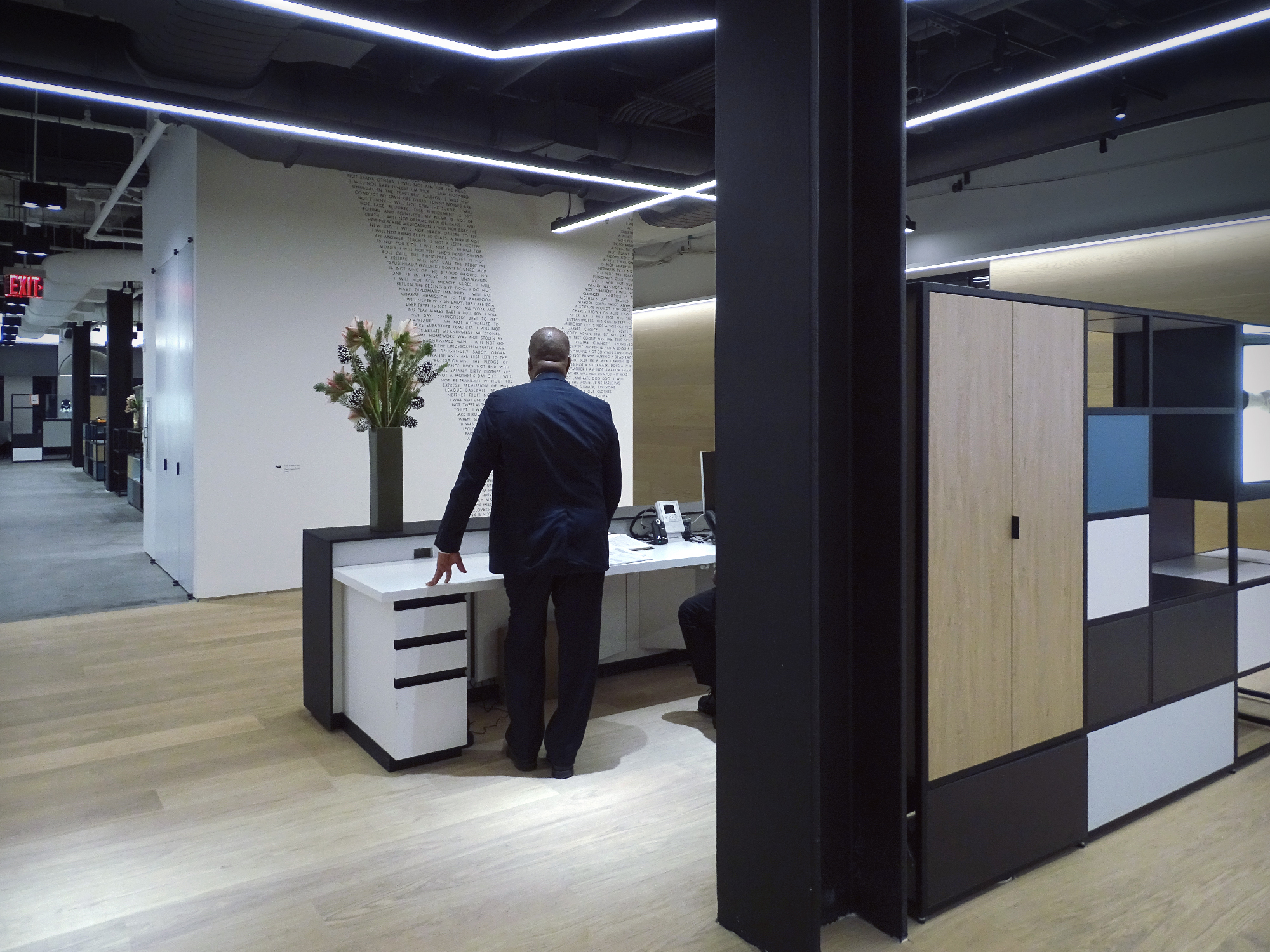
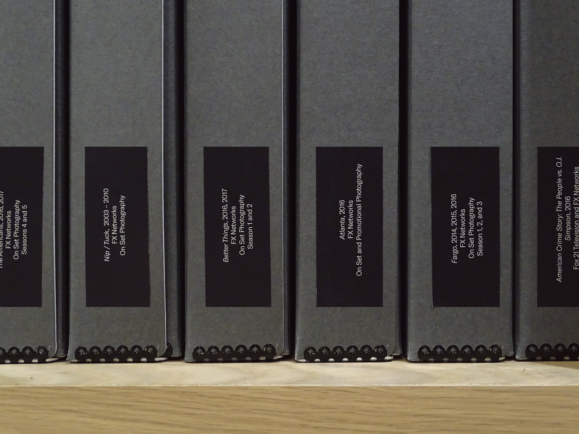
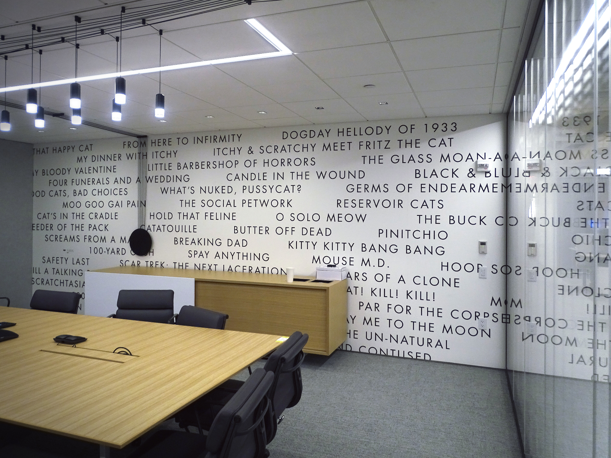
For the the main lobby entrance on 44, we put every chalk board message from The Simpsons (1989 – present) title sequence on the wall opposite reception.
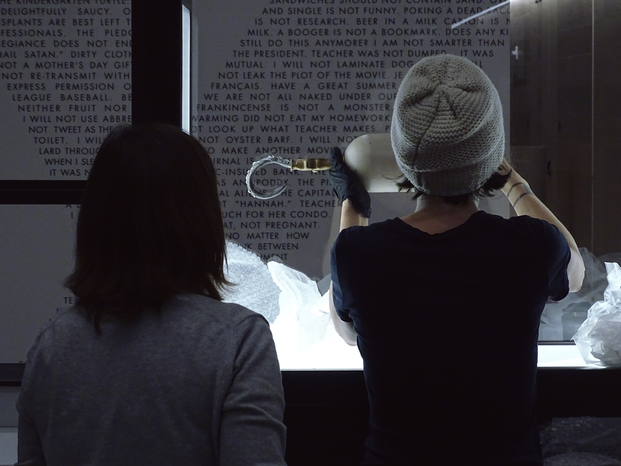
Two of my favorite items in the installation, the satellite case directly behind reception contained Buster Bluth’s hook and rubber hands from Arrested Development (2003 – present).
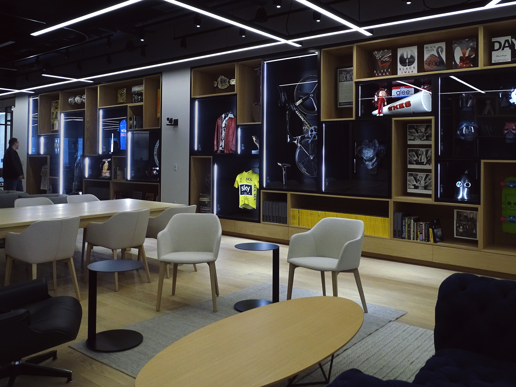
![]()
Gensler had commissioned Swiss furniture legends Vitra to create custom shelving that we could integrate into our gallery proposal.
Gretel hired independent curator and project manager Stephanie Baptist to be my fellow creative, partner in crime and coordinator on our end. We also hired local architect Corey Yurkovich to collaborate with us on gallery design and liaison between the various vendors involved in a construction project of this scale.
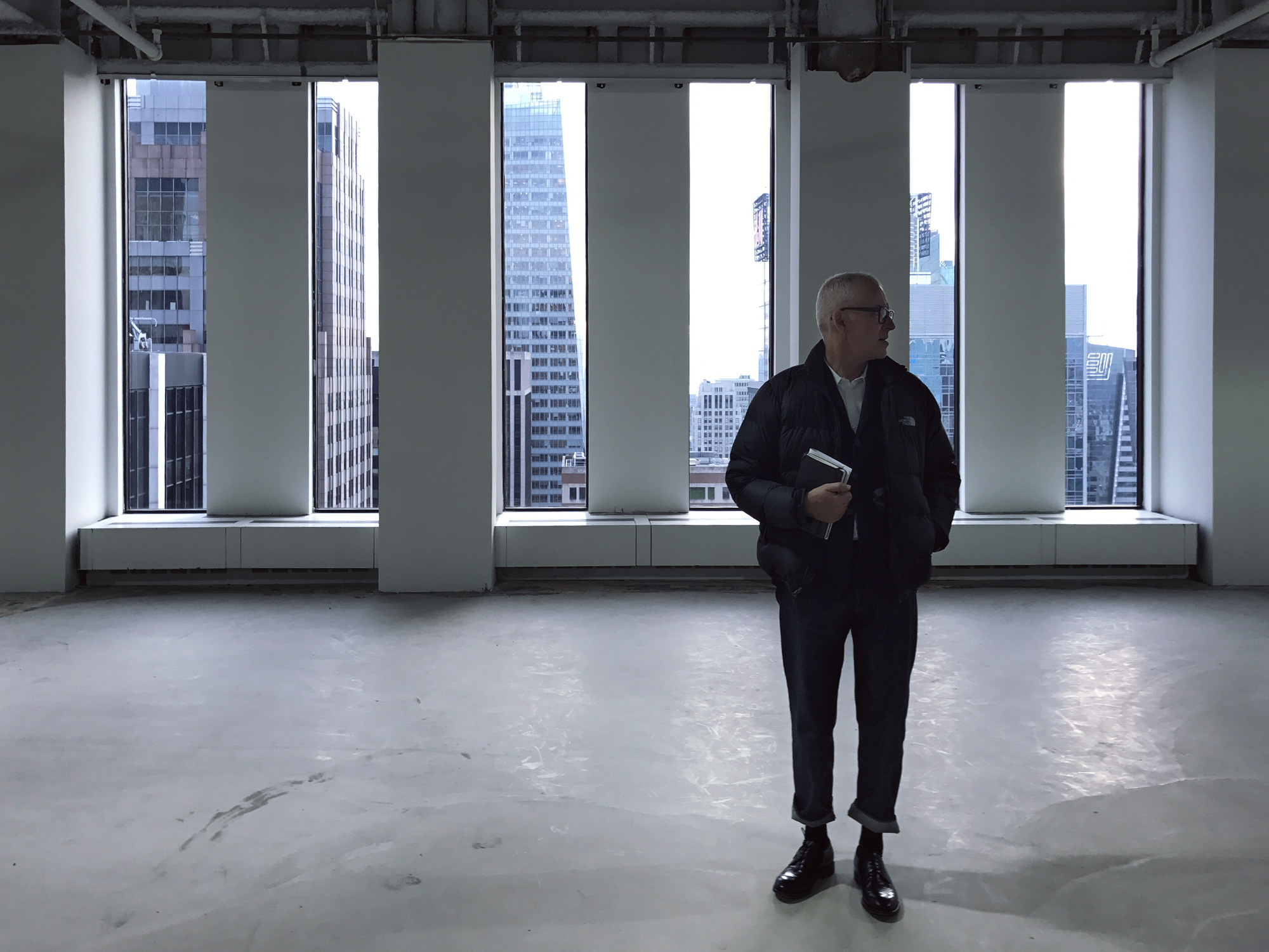
I worked closely with Gretel owner and chief creative Greg Hahn, ECD Ryan Moore, art director Caleb Halter, and a smattering of staffers, hired guns and big brains that I am proud to call friends, including Stephanie Baptist, Kyle Baron-Cohen, Eric Scott (pictured, left), James Wu, and Eva Green. Gretel staff producer Kerry Griner kept it all under control, on schedule, and on budget.
The last piece of the puzzle was hiring Object Mounts, a small team of museum installation experts that my sister Sheelagh often works with in her role as a curator at The Morgan Library. They built custom mounts for almost everything.
![]()
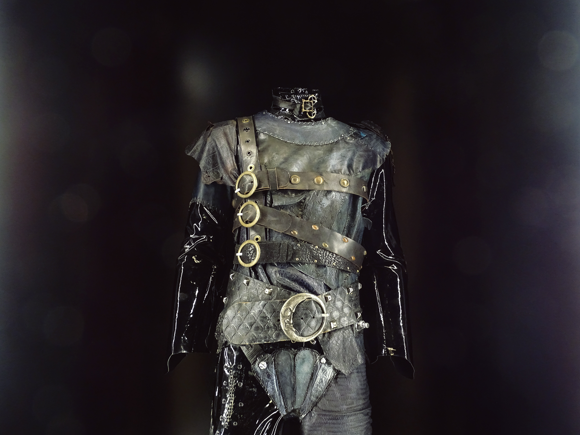
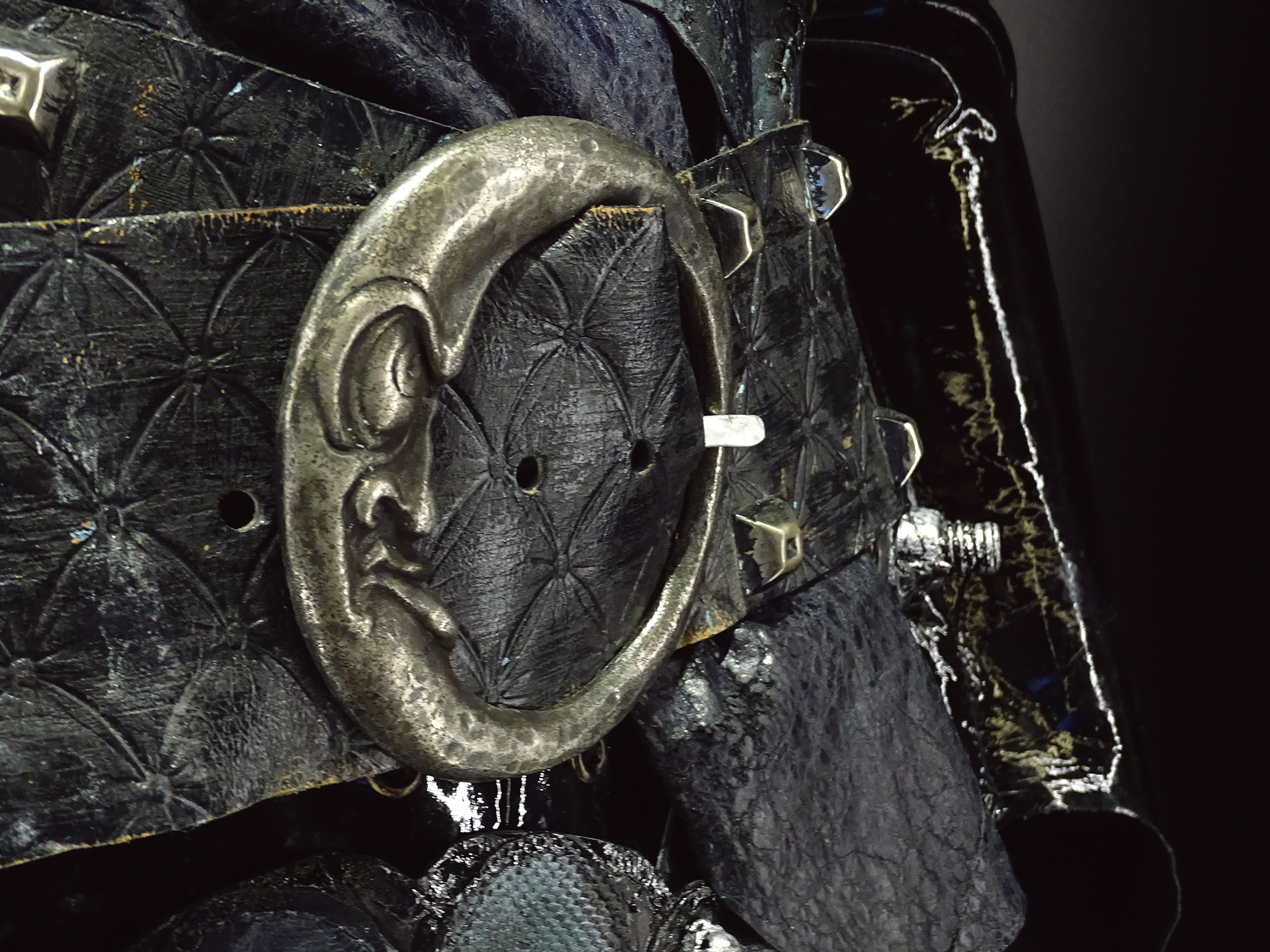
The Edward Scissorhands (1991) costume is an incredible piece of craftsmanship. The hands had to be put on their own plinth because the fabric is too fragile to hold their weight. Costume designer Colleen Atwood conceived Johnny Depp’s outfit as a combination of 19th Century Victorian styling and 20th Century machine parts. Vinyl was used to enhance the character’s prefab image. Director Tim Burton described Edward’s look as a mix of Charlie Chaplin’s Tramp and Mel Brook’s Frankenstein.

![]()
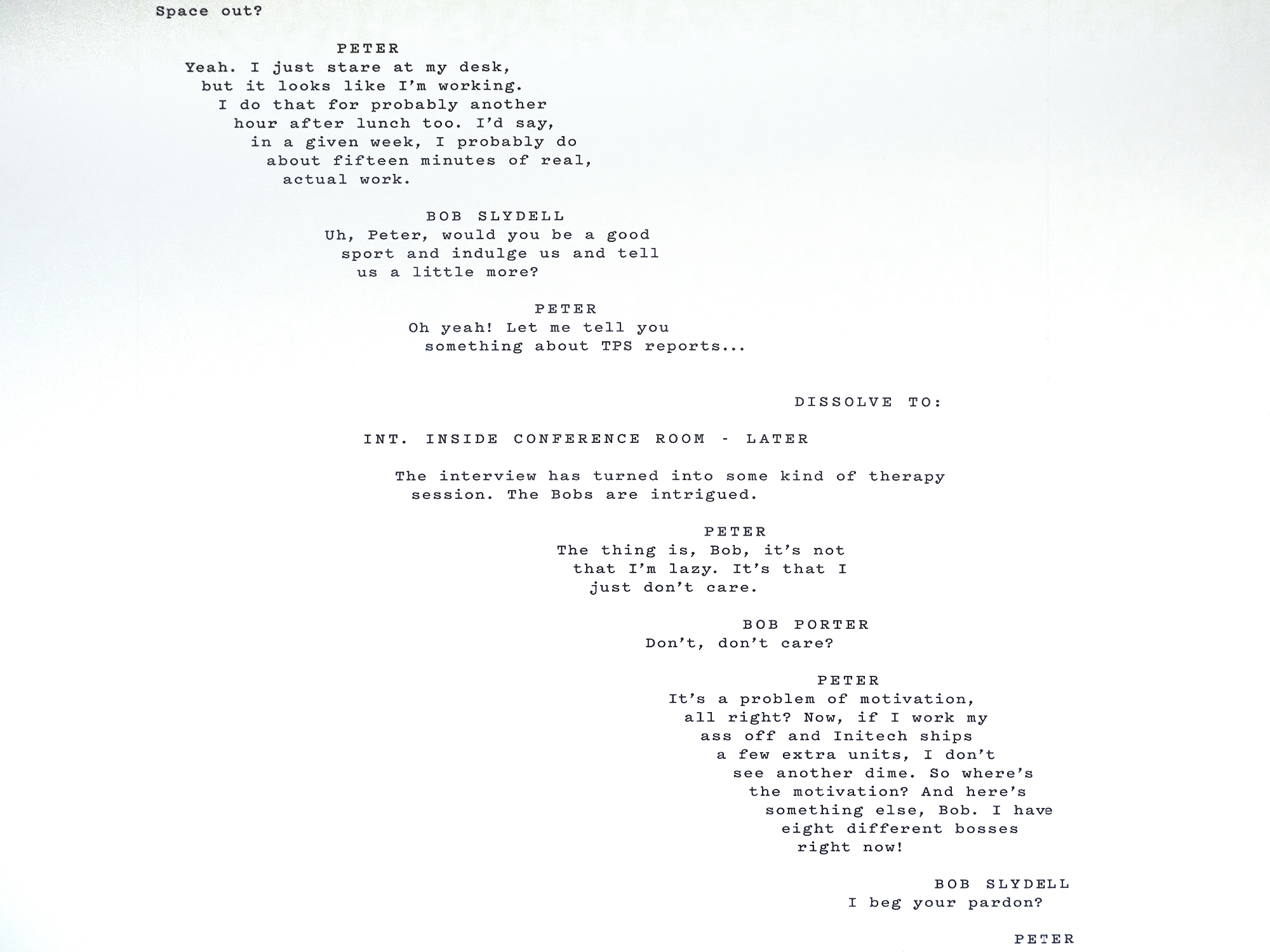
Getting this quote from Office Space (1999) into an actual, corporate office space was admittedly a big point of subversive pride for Ryan and I.

![]()
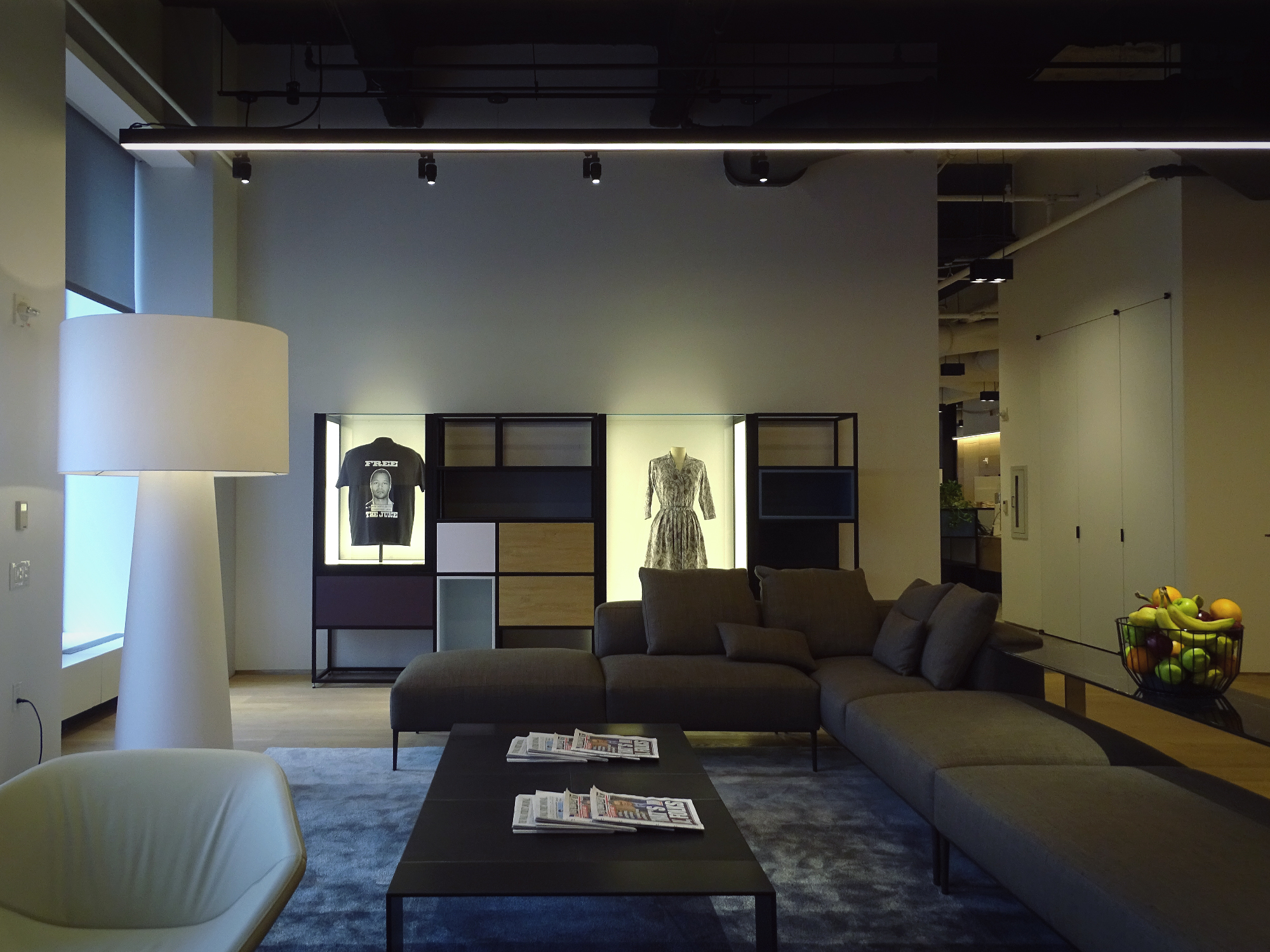
Left: an original “FREE THE JUICE” T-shirt from FX’s The People V. O.J. Simpson (2016). Right: Dress worn by Katherine Johnson (Taraji P. Henson) in Theodore Melfi’s Hidden Figures (2016). Melfi recruited costume designer Renee Ehrlich Kalfus to create a vibrant 1960s wardrobe that perfectly distinguished the personality of each character.
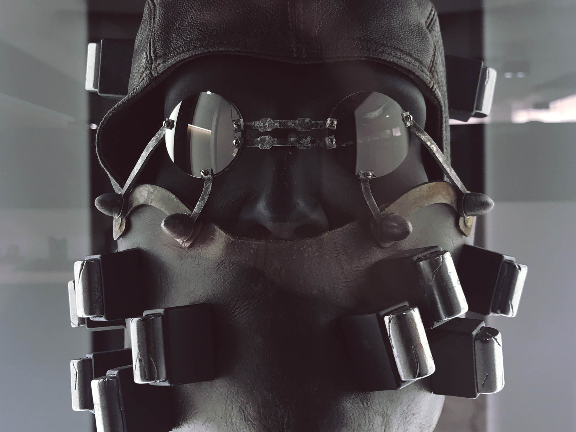
Mask worn by James March (Evan Peters), in American Horror Story: Hotel (2015 – 2016). Masks such as these were used in the 1920s to treat cancer of the face and neck.


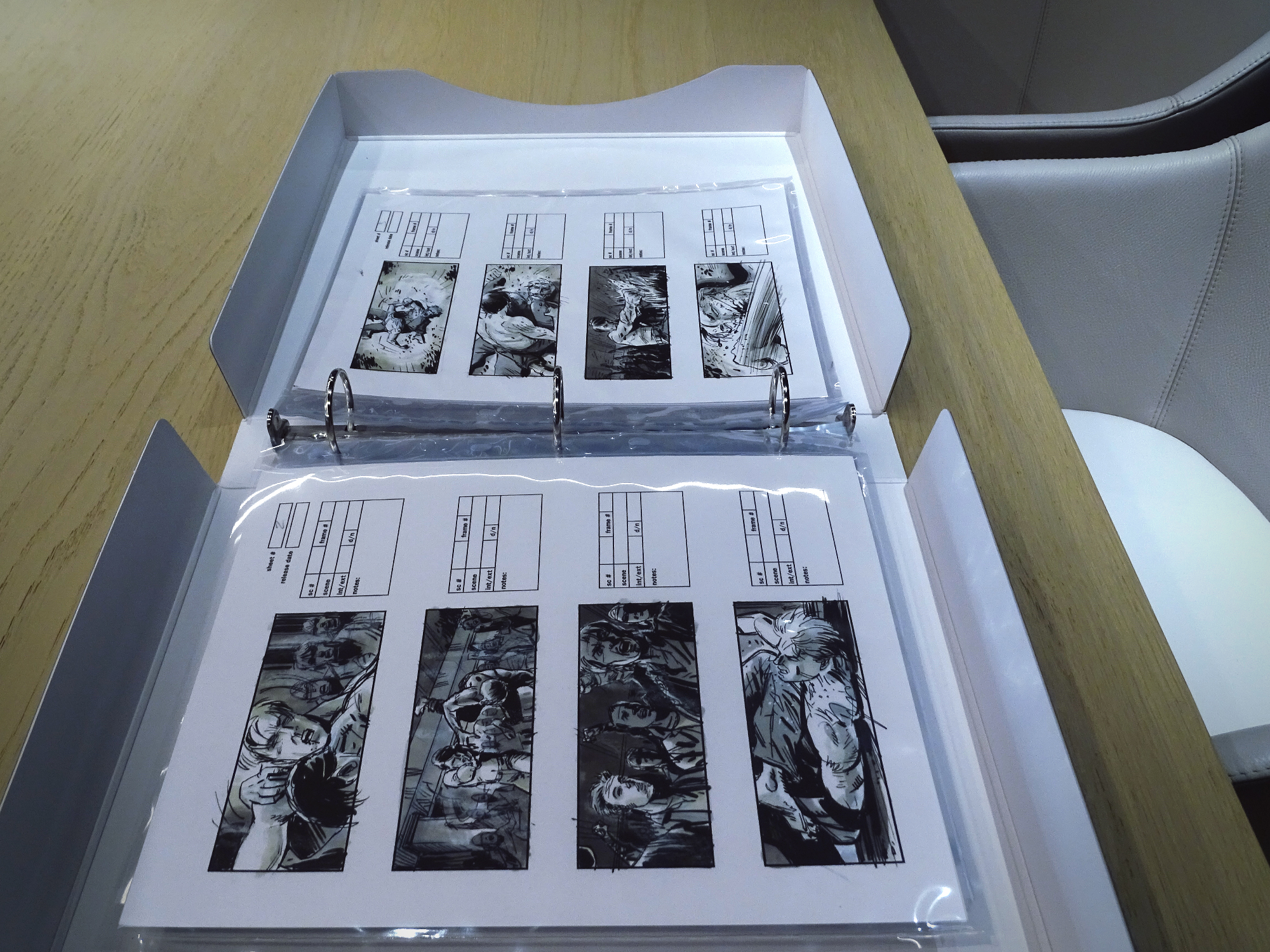
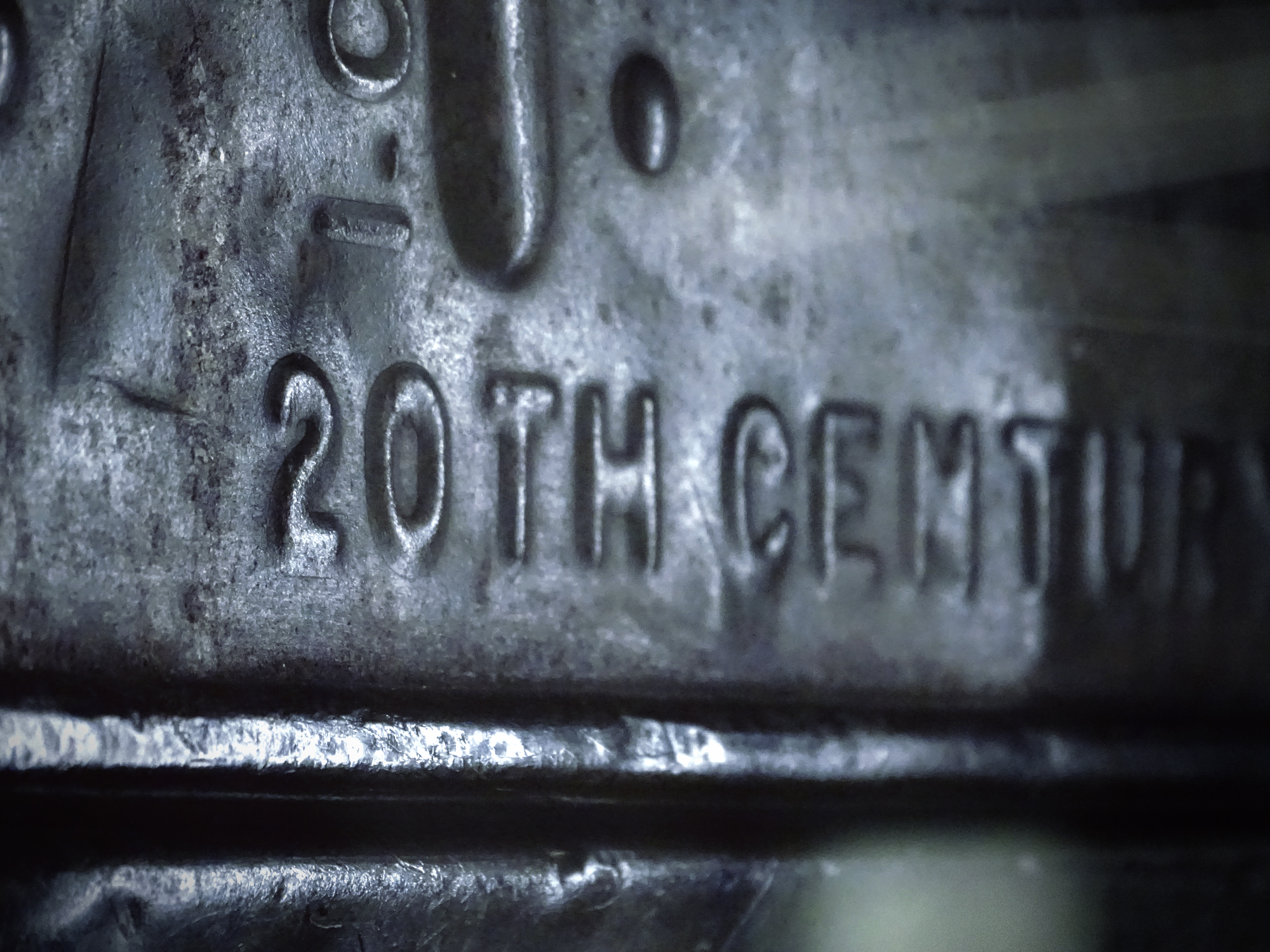
Inspired by my visit to the 20th Century Fox archive, we filled some of the shelf space in the main gallery with the same kind of archival file boxes used on the backlot. Photos, storyboards, scripts, concept art and technical drawings from the various brands. I’ve always been a sucker for anything process-related.

![]()
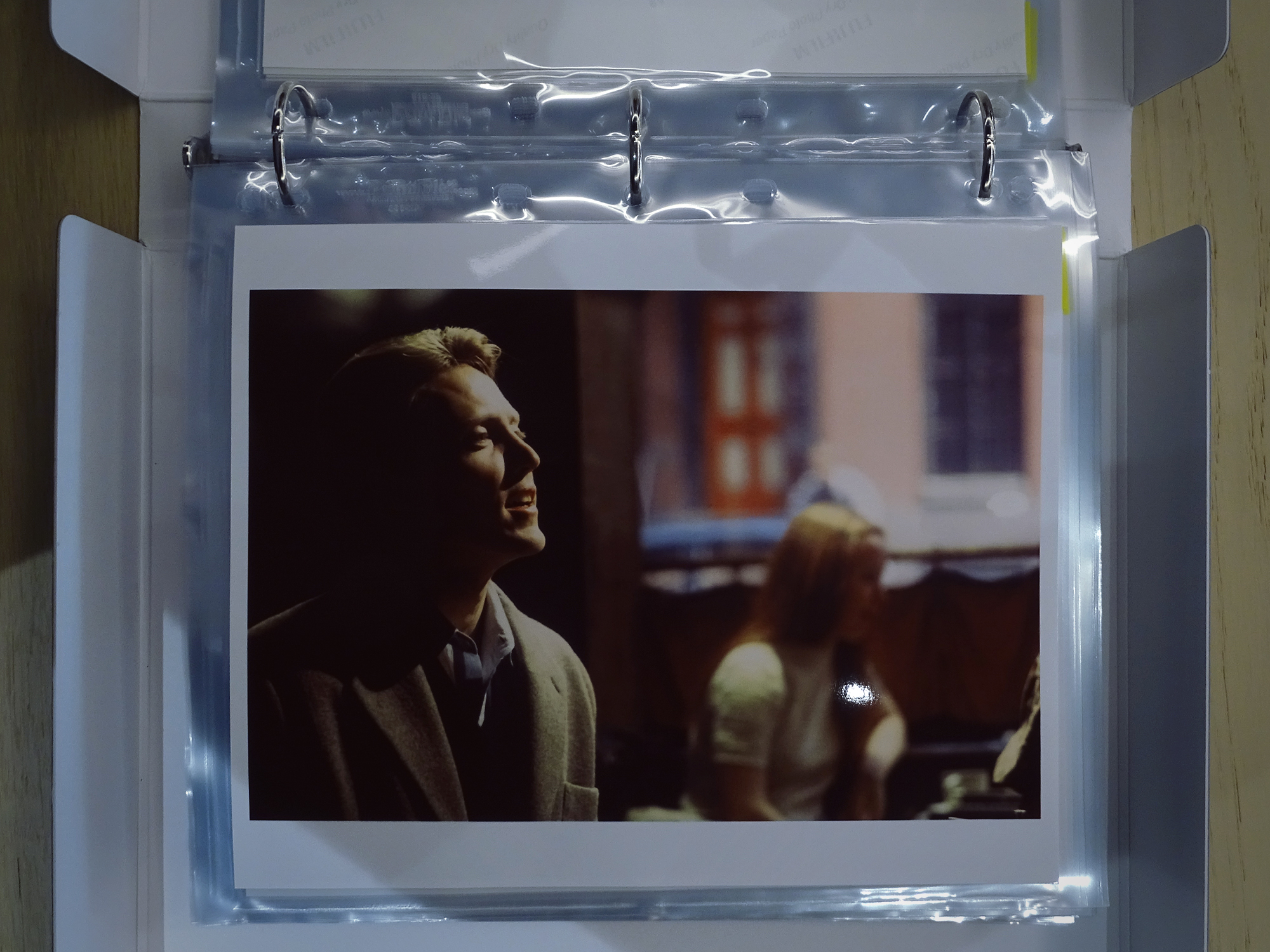
I must also confess being rather proud of myself for being the only person on the 20th Century backlot to ID this image from an early Christopher Walken movie, Next Stop, Greenwich Village (1976). Even the staff was stumped.
![]()
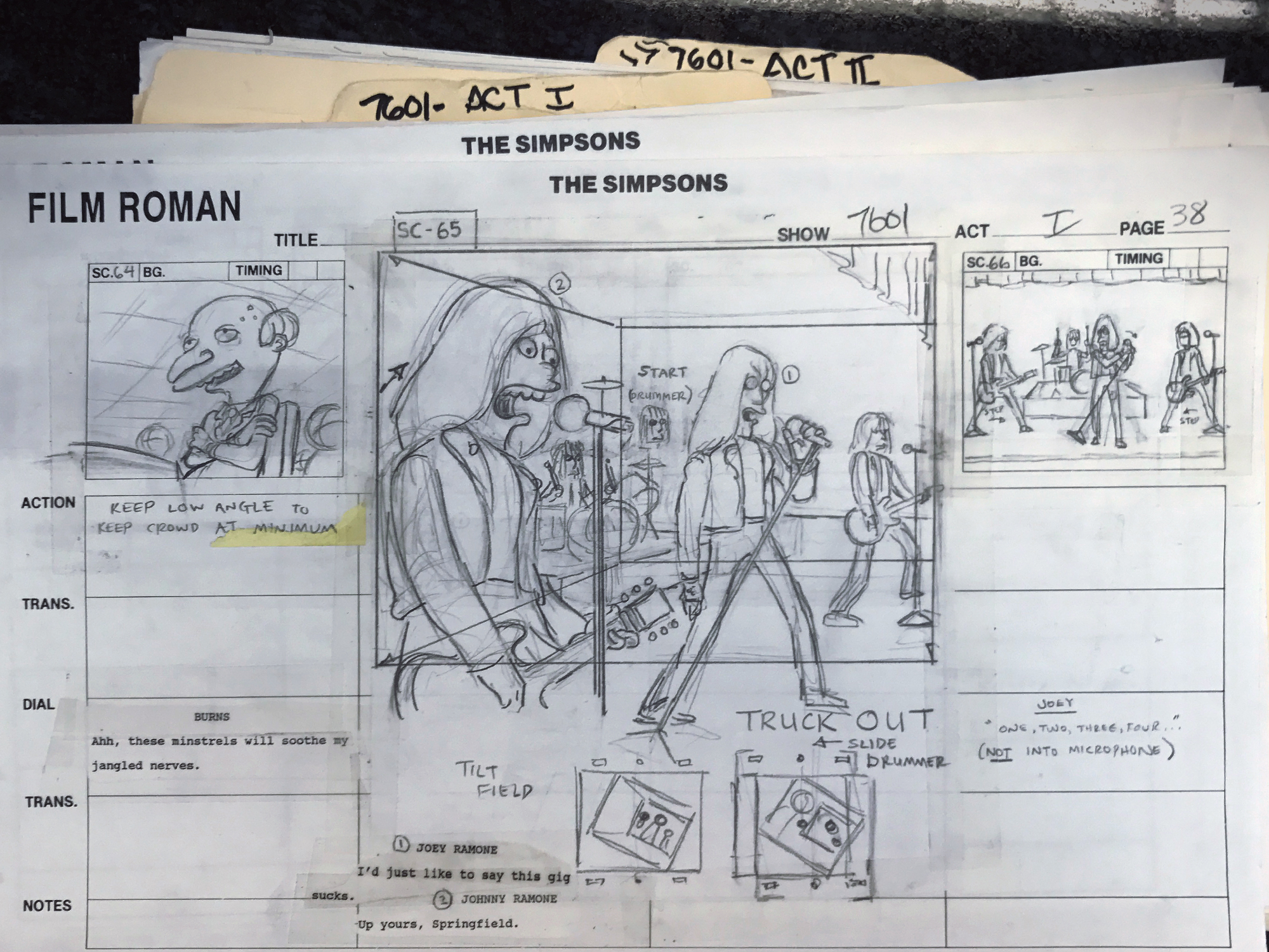
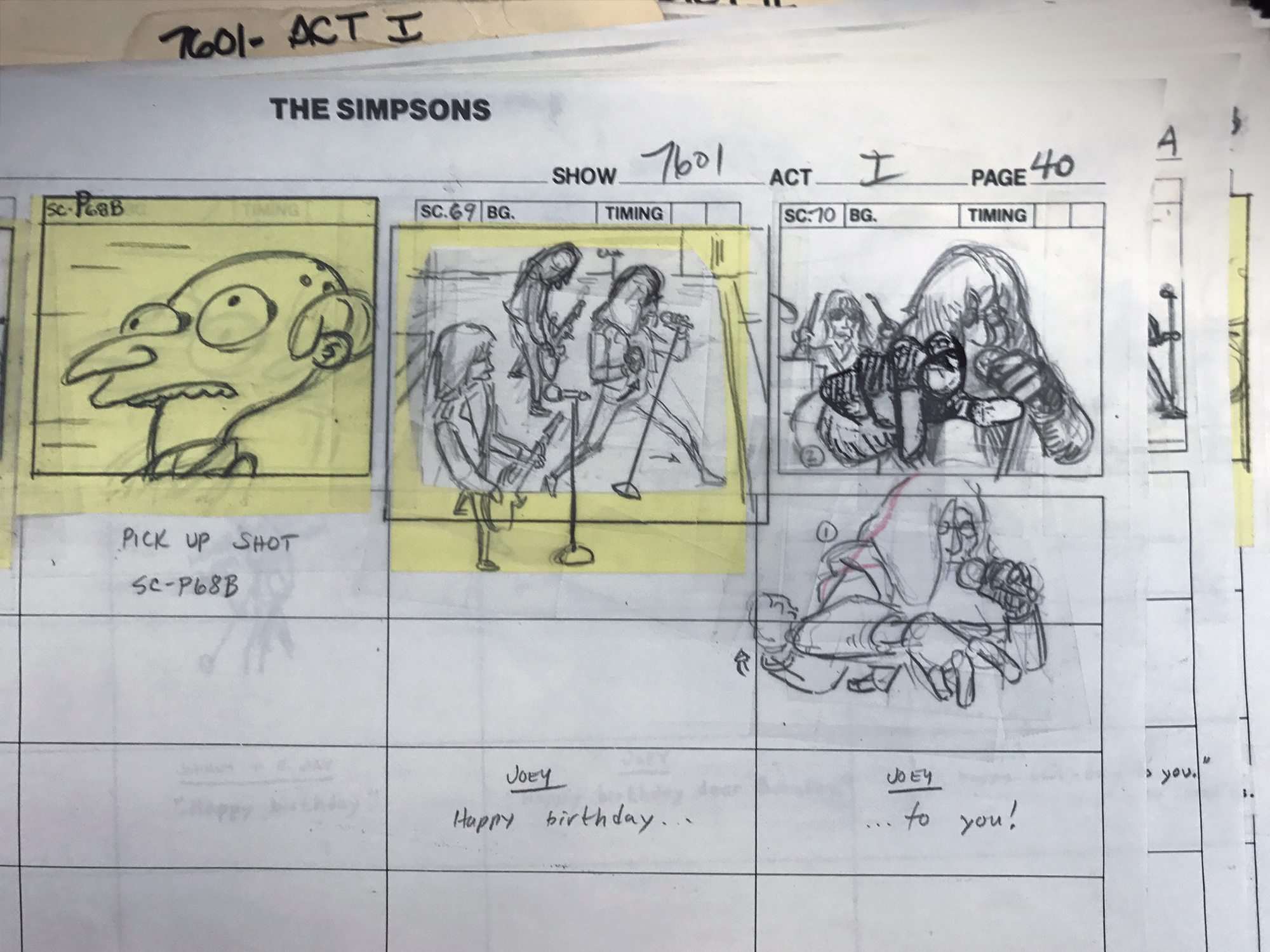
Other storyboards were significant enough to make it into satellite display cases, like these hand-drawn works of art by The Simpsons director Wes Archer. These are from Rosebud (s05e04 – 1993). Written by John Swartzwelder, Rosebud is largely a parody of Orson Welle’s Citizen Kane (1941) – the title a reference to Charles Foster Kane’s dying word. The Ramones famously guest starred as themselves, singing happy birthday to Mr. Burns. Marky Ramone later called their appearance “a career highlight”. It’s hard to express how much of a thrill it was to visit the Simpsons archive in Burbank. Just to be in a room with a bunch of adults that got every reference I could muster was worth the price of admission.
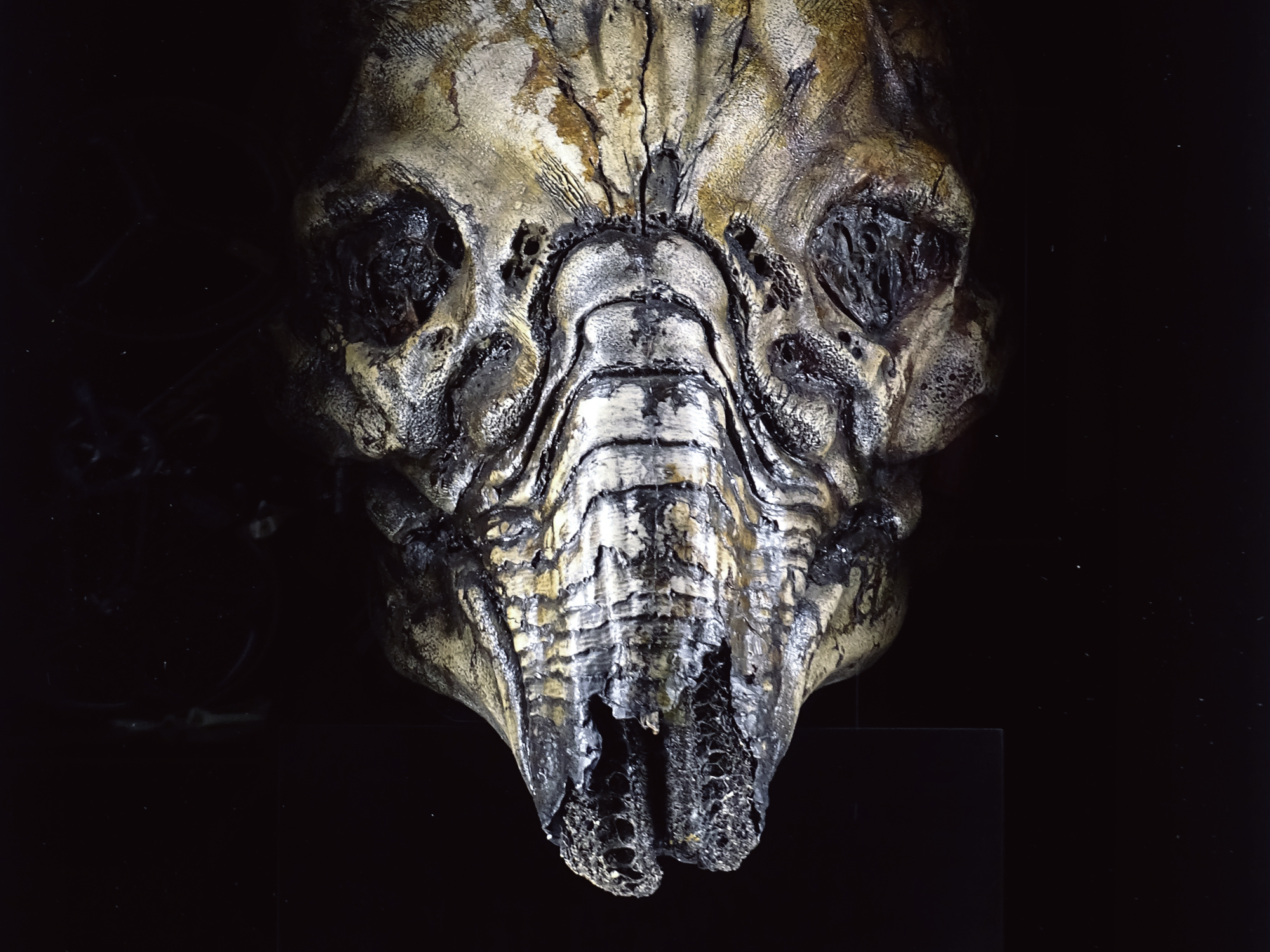
The engineers from Prometheus (2012), the 5th installment in the Alien franchise, were the vision of producer Ridley Scott, character designer Neville Page, concept artist Steven Messing, and acclaimed illustrator H.R. Giger. The engineer’s suit was based on Giger’s original concept drawings for Alien (1979), the first film in the series. This thing is massive, BTW.

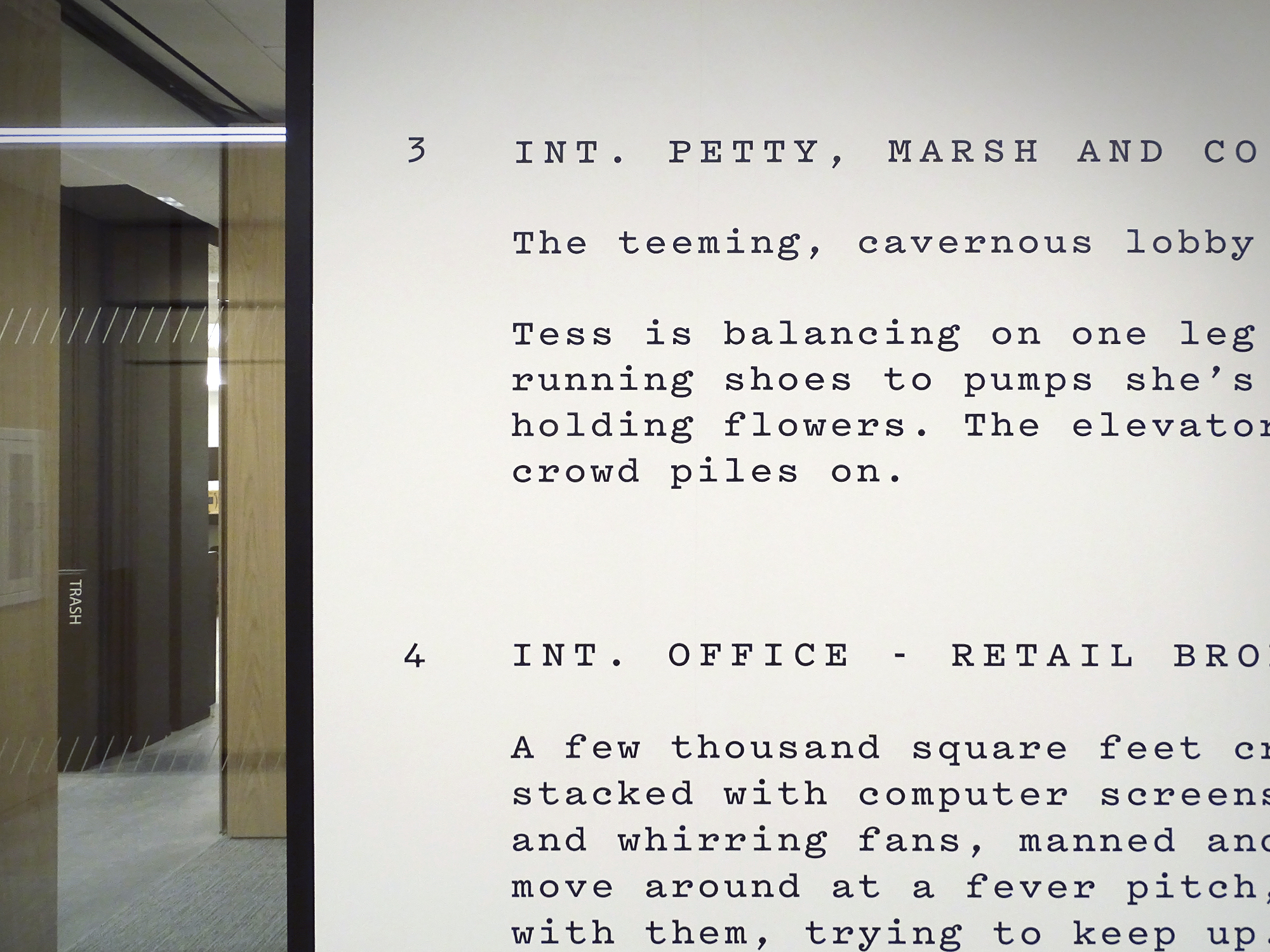
Description of an interior office scene from Mike Nichols’ Working Girl (1988).
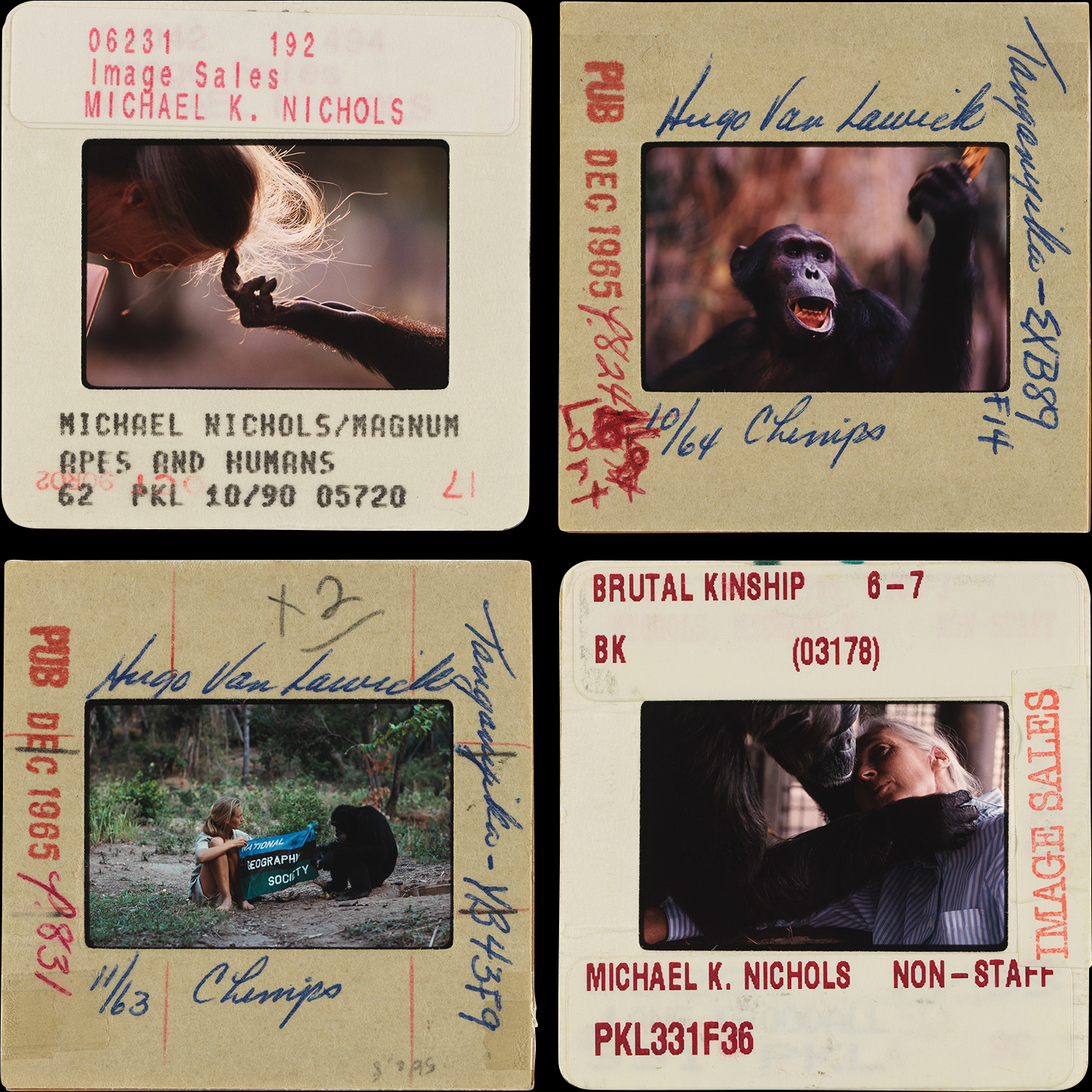
Some absolutely gorgeous slides of Jane Goodall and friends I found in the National Geographic Archive in DC.
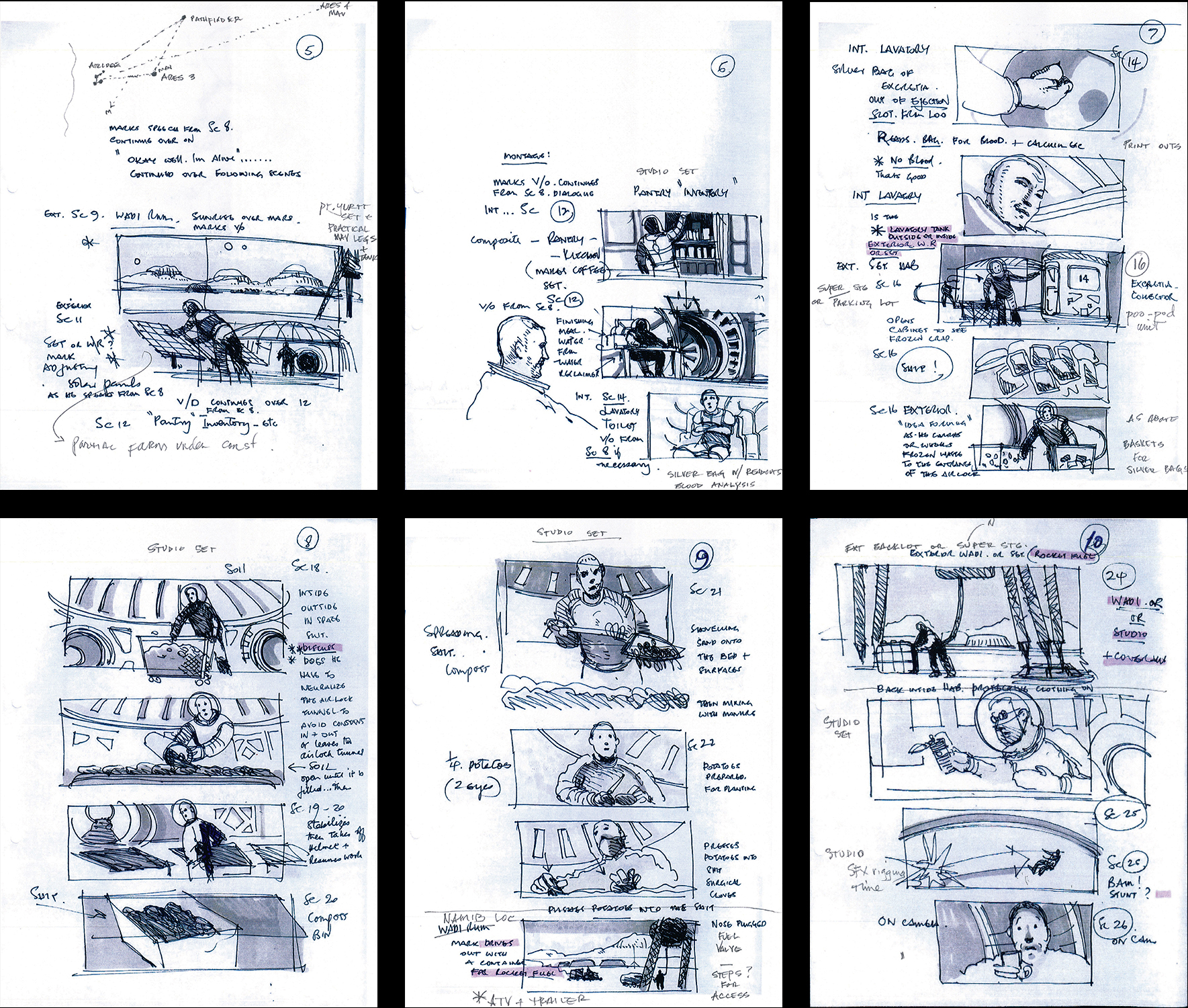
Storyboards from the potato garden explosion in Ridley Scott’s The Martian (2015).
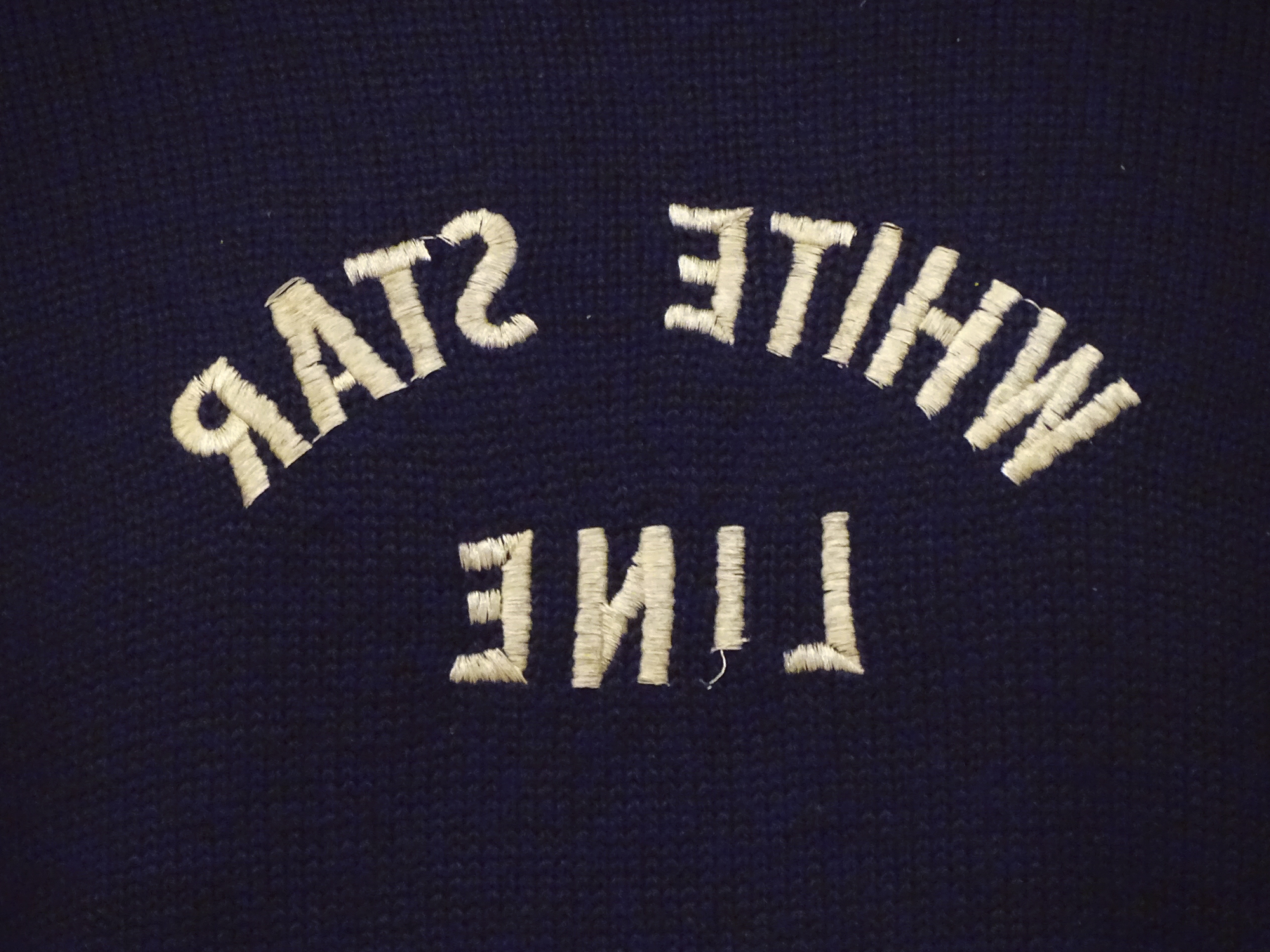
For exterior shots in Titanic (1997), James Cameron built a near-full-size replica of the ill-fated ship. Due to budget constraints, only the starboard side was constructed. Scenes that took place on the portside of the boat were shot on the same starboard side, but using props with the White Star Line logos embroidered back-to-front, so that when the film negative was printed, it could be “flipped” in the edit room, creating the illusion of both sides of the ship. Any costumes with asymmetrical elements (embroidered typography, a broach, a pocket square, etc) had two versions, one regular, and one they called “the flop”.
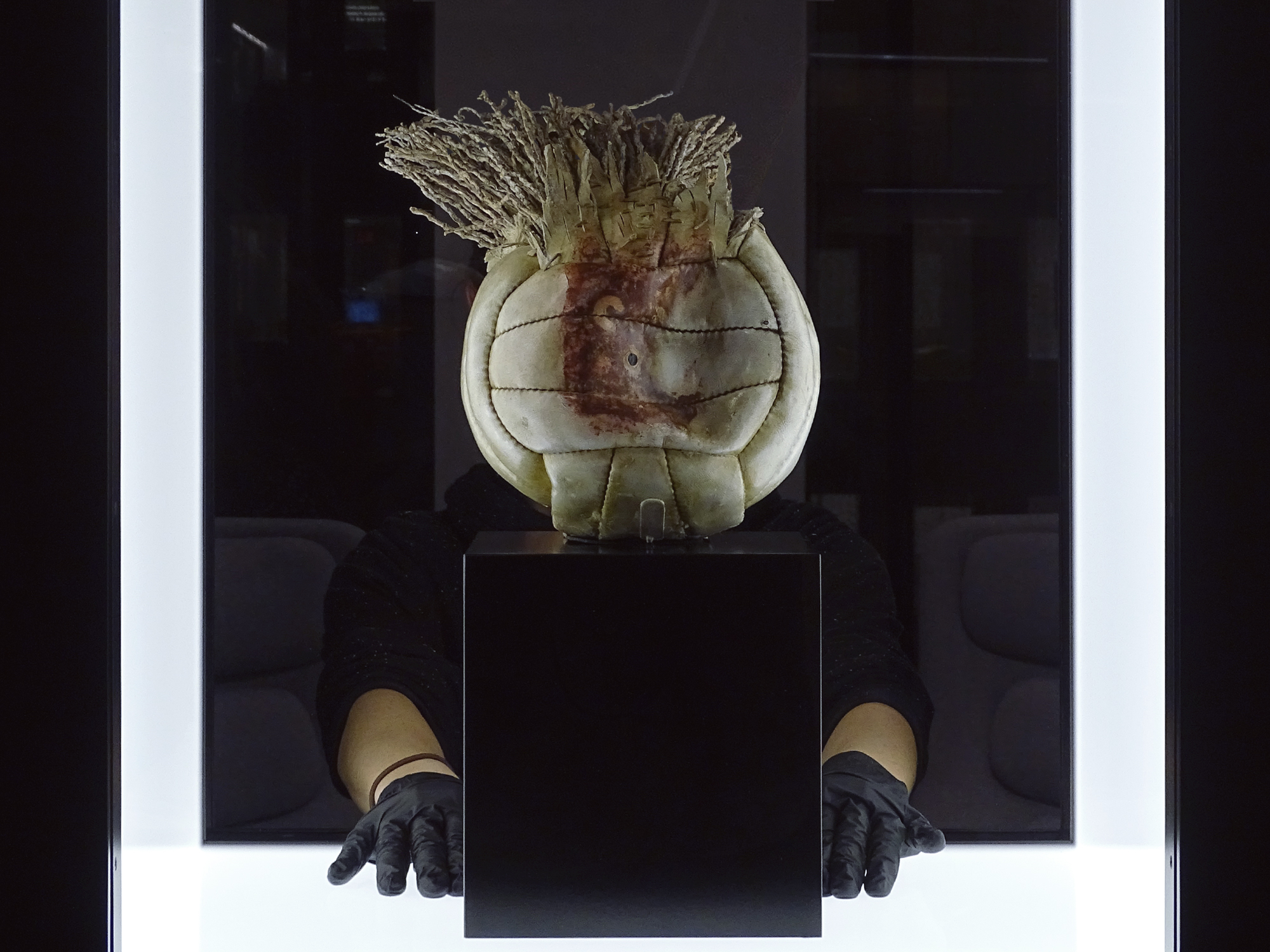
One last, special item: Wilson, the anthropomorphized volleyball that served as the sole companion of Chuck Noland (Tom Hanks) during the 4 years he was stranded on a deserted island in Robert Zemeckis’ Cast Away (2000). In doing research for the film, screenwriter William Broyles Jr. stranded himself on a deserted island in the Gulf of California for one week. During that time, a volleyball washed ashore, sparking the idea for the character. Wilson won a Critic’s Choice Award that year for “Best Inanimate Object.” Our prop master from 20th century Fox, Tamirin Panama, treasures this piece so much that she flew out to NY in business class with Wilson on her lap.