BET REBRAND
I’m very proud to share this award-winning project for BET. Since its inception in 1980, BET has always been rooted in serving Black people and the Black community. With a 40 year legacy of celebrating Black excellence, BET remains the only brand that represents the fullness of the Black experience, not only in the United States, but around the world, with an ever-growing presence in Western Europe, Africa and Asia.
In late 2020, I was approached by Kendrick Reid, SVP of Brand at BET, who told me BET was rebranding, soup to nuts, followed by the question: what I was doing for the next 6 months. My role would be Co-Creative Director, Brand Strategist and Copywriter. Kendrick and I go way back, to when I was designing show packages and graffiti-laden graphics for him at Comedy Central, during the golden, Dave Chapelle years. He was looking for the right shop to task with rebranding the global BET ecosystem, and no matter where the job landed, he wanted me on the creative leadership team.
This was an incredible opportunity, and the direct result of years of hard work, freelancing as a Creative Director and Copywriter for the network and their affiliated vendors. In the past, I helped launch BET’s streaming service. I created brand identities for tentpole events. I built launch campaigns for premiere content properties. Etc. As luck would have it, all of those projects had given me a uniquely deep understanding of the brand and their audience. This nuance of understanding was different. It was bigger than simple, data-driven insight. This was not something I took lightly. To me, this was more akin to a responsibility. To be blunt, the list of white boys that get entrusted to help shape the identity of one of the biggest Black media brands on earth is very short indeed, and I’m honored to have made the cut. How could I say no?
The job was soon awarded to Sibling Rivalry, one of the premiere design studios in NYC, with whom I already had a great working relationship. Not to mention, complex, large-scale media rebrands is something they knock out of the park, every time. I teamed up with ECD Joe Wright, CD Rosie Garschina, fellow hired gun CD Jason Moses, and PM Gary Encarcion. We set about building a diverse team of designers, animators and writers to help us crack the case.
The best part was we would be working closely with SVP of Brand Kendrick Reid, VP of Brand Adrian Hilton, and a ton of other great creative minds on the brand side that I’d worked with for years. Jonathan Fouabi. Fabienne Roc. Mike Williams. Jerome Ford. As well as freelance talent like Victor Newman and Kerry Laster, to name a few. These are all stellar creatives. Some of whom I’m proud to call close friends. This was a dream team and a dream job, indeed.
After almost two months of interviews with the key stakeholders around the country and around the world, we understood the mantle we’d be given. We were reimagining the brand. More than an evolution, this was a revolution. This was an opportunity to modernize, but more importantly, a way to future-proof the brand for years to come. And given BET’s unique role in the landscape of entertainment and Black culture as a whole, it was not only a branding exercise, it was a cultural statement.
THE BIG IDEA: BLACK CANVAS
As the destination for all forms of Black creative expression, the concept of Black Canvas became the heart of the new visual identity. Black creators. Black visionaries. Black talent. They all come together in one place. This concept really resonated with the creative team at BET. They loved the idea that it was a place where any and all forms of Black Excellence could be expressed.
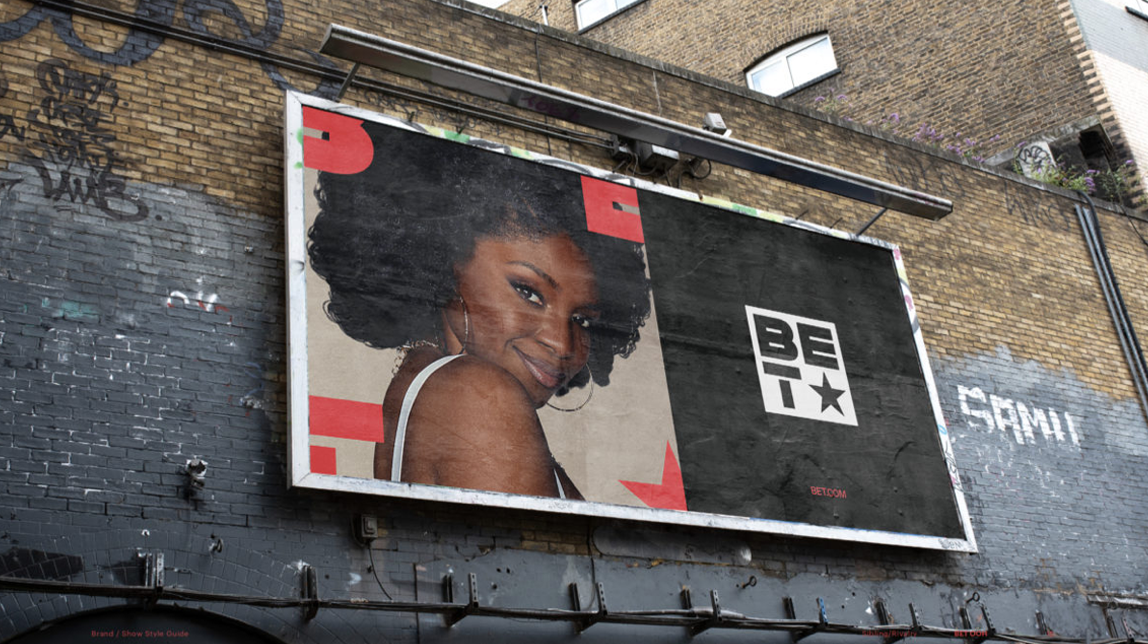
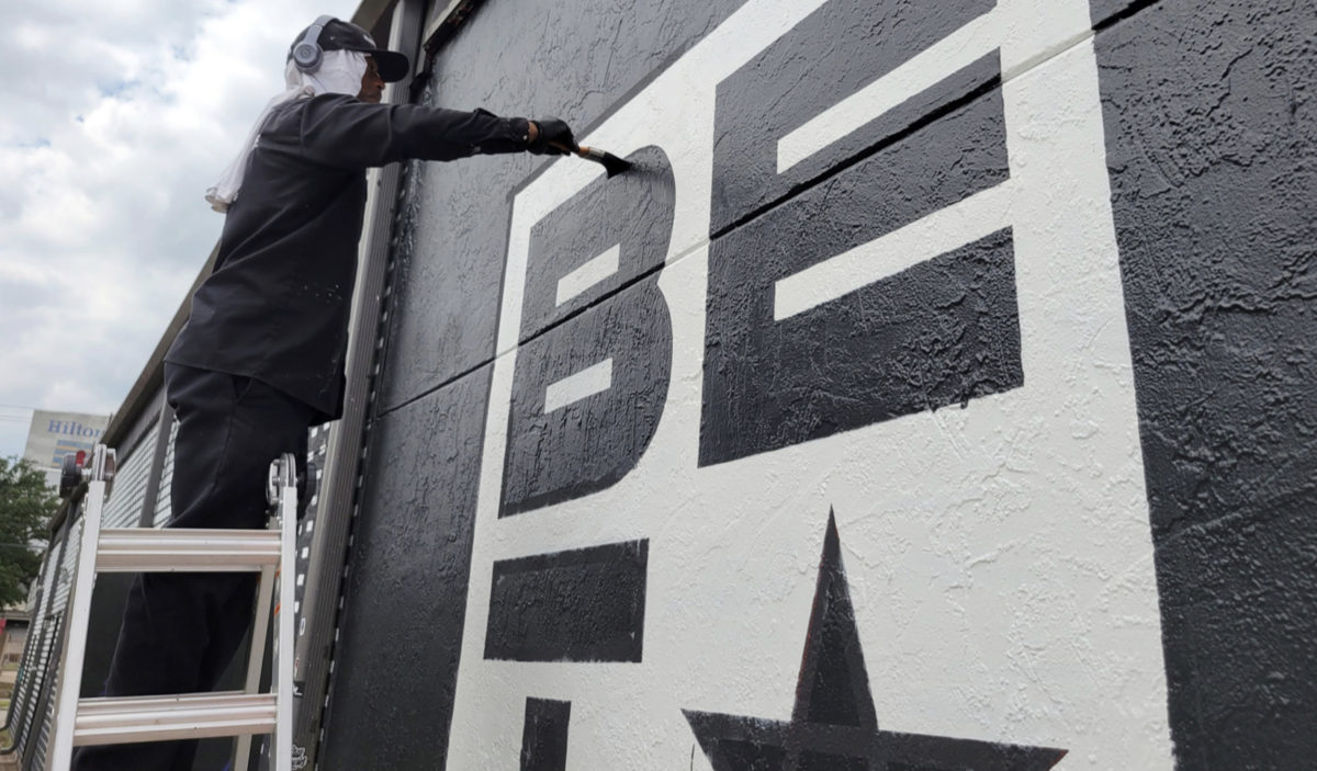
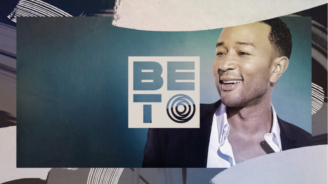
LOGO + BRAND ARCHITECTURE
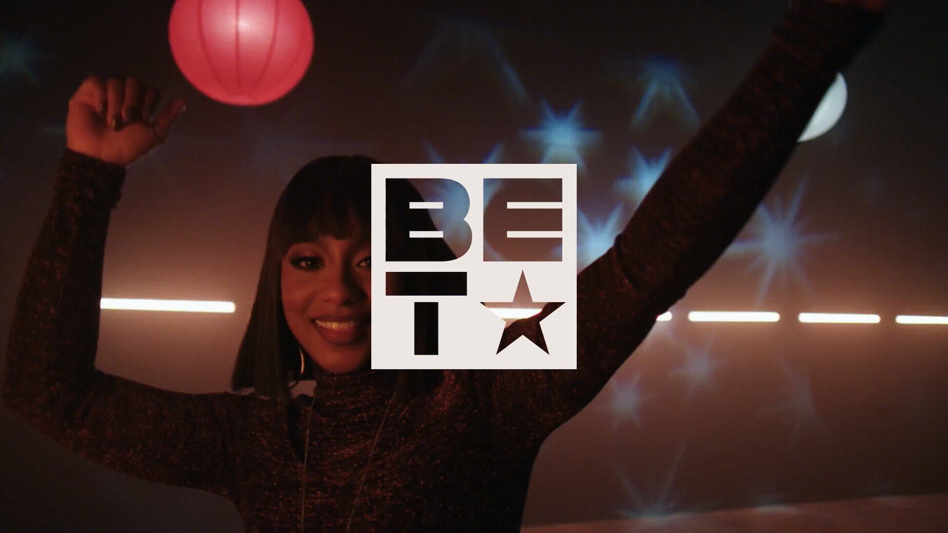
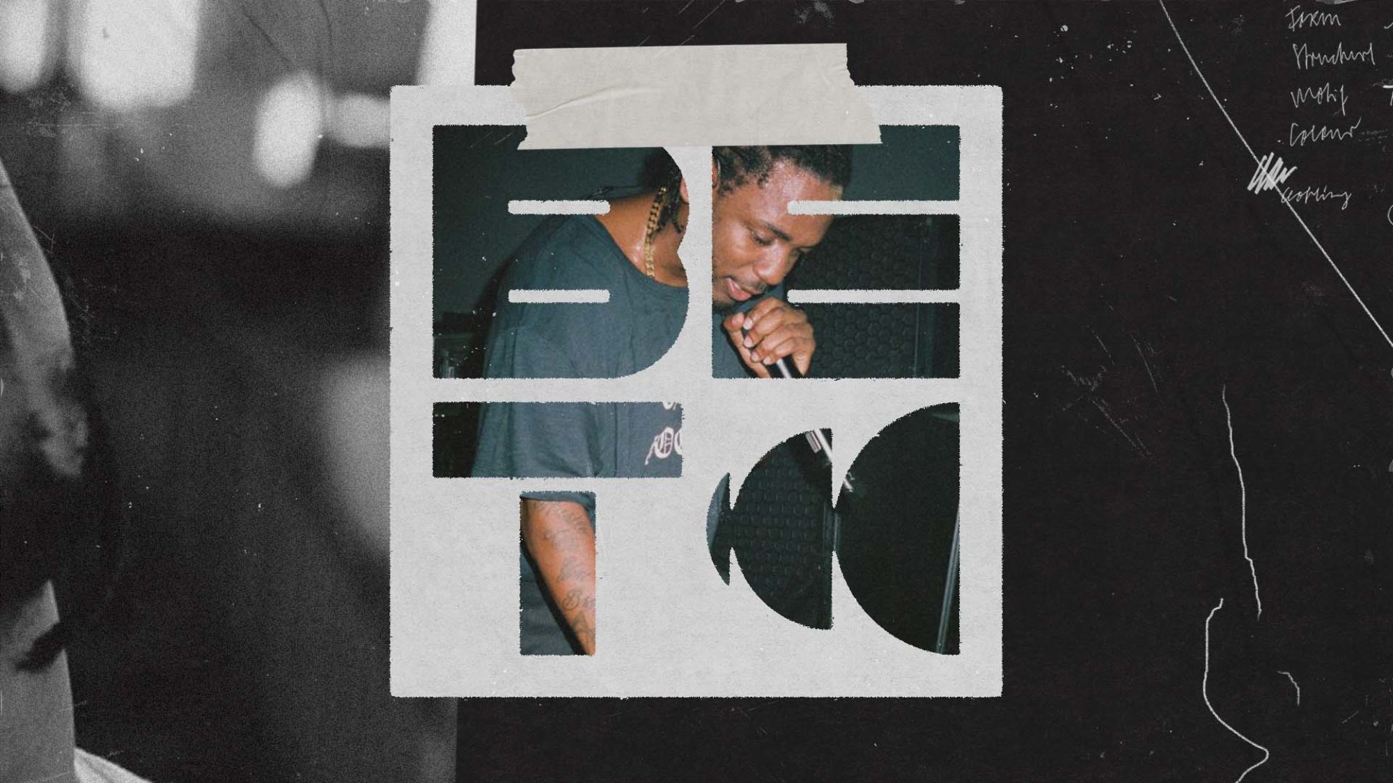
This Black Canvas foundation became the catalyst for how we approached the redesign of the logo. We deconstructed the existing logo, modernizing the three letterforms, retaining the signature BET star, and reimagining it in a completely new way. The starting point was a simple black square. Our Black canvas. This canvas could ultimately take on any shape or form, designed as a device to showcase all forms of expression. At the end of any application, we return to the square, the neutral state for the identity.
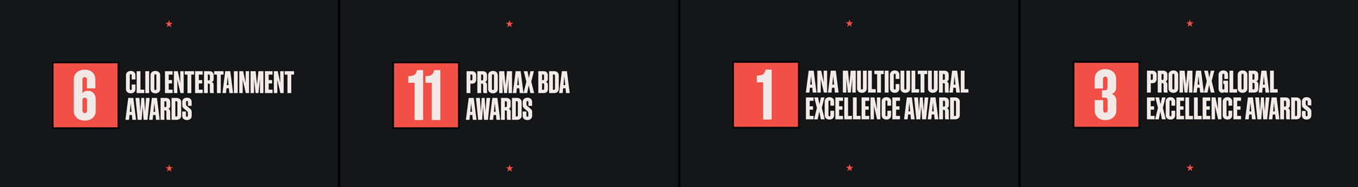
When we first showed the new logo to the president of the network, his initial reaction was, frankly, one of dismay. “You broke my logo!” He exclaimed. As designers, we knew we had a very tough sell on our hands. But we really believed in it. Sibling ECD Joe Wright was steadfast in his determination to sell it through. And to their credit, key creatives at BET championed the logo as well. In time, we won over every stakeholder, and finally had a green light to finalize our designs. As a creative, I cannot overstate how important it is to work with people like Joe, Rosie, Kendrick and Adrian, who are willing to fight for great ideas and great design. In the global corporate media world in which we operate, safe choices are the default behavior of so many top-level executives. It takes conviction and resilience, but you can get there – if you make good choices and work with the right people. The logo won BET a 2022 Bronze Clio Award.
![]()
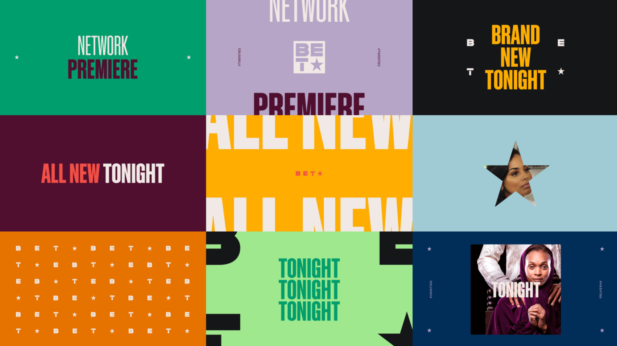
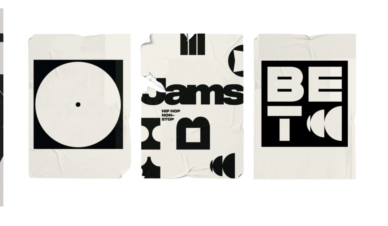
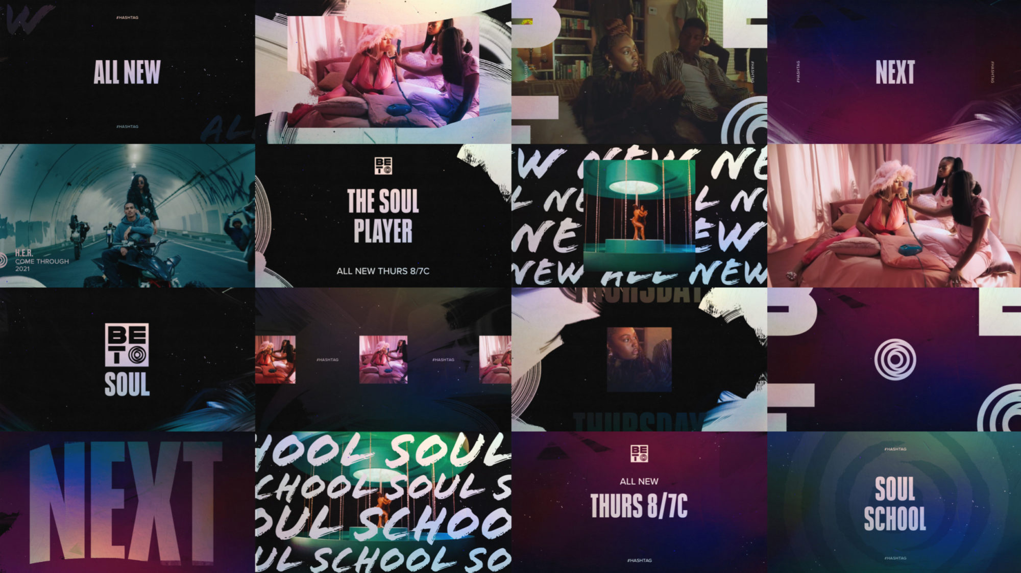
The square motif gave us a new tool to create unique logos for each of the sub-brands, BET HER, BET JAMS, BET SOUL, THE BET EXPERIENCE, and BET PLUS – tethering them to the master brand, while giving each its own distinct voice. This highly flexible system also allows for new properties to be added, or temporary promotions to become seamlessly embedded in the brand architecture (Black History Month, etc). The rebrand won a Bronze Clio Award.
![]()
![]()
LANGUAGE SYSTEM
I developed a modular language system built around the idea of the brand as a destination. The place where Black Excellence lives. This evolved into a series of lines that could flex to speak for the brand, for individual sub-brands, for specific content, and specific talent. The language could be modulated in tone, to fit the appropriate level of casualness or gravitas that the moment required.
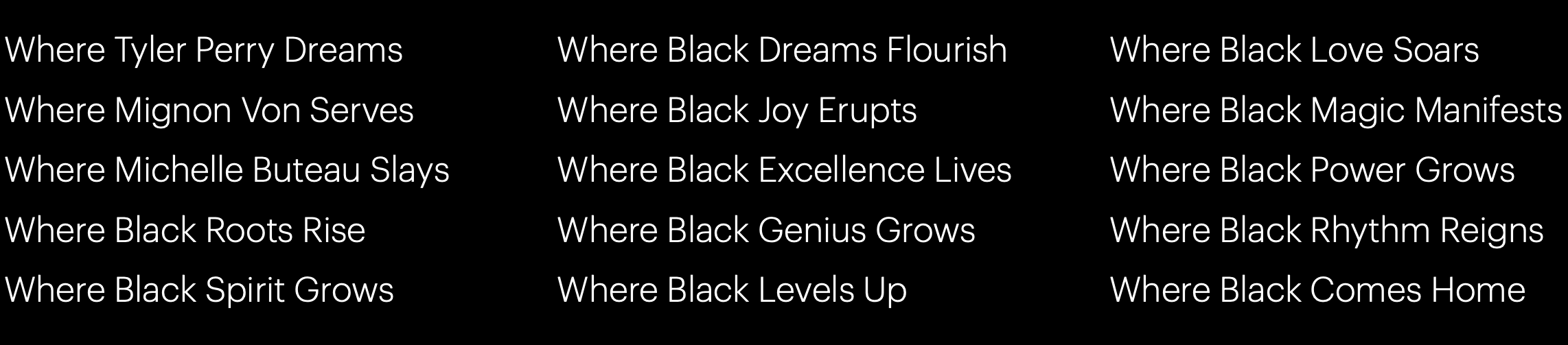
The language system was warmly received by the folks at BET, becoming the foundation of a Bronze Clio-Award winning, groundbreaking projection event on the Hollywood sign in LA, and a Silver Clio Award-winning national image campaign.
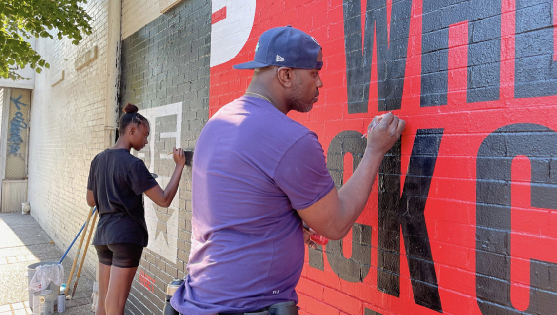
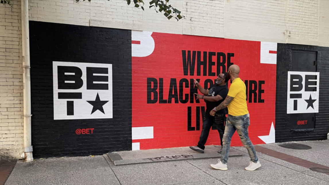
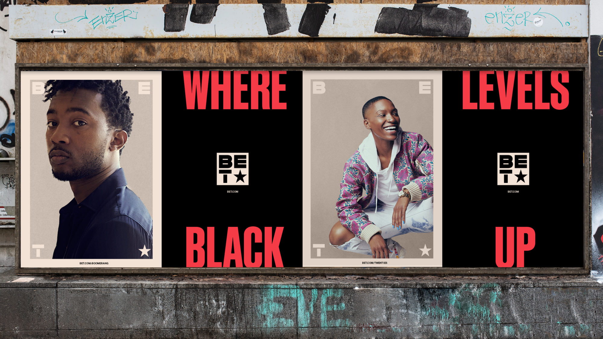
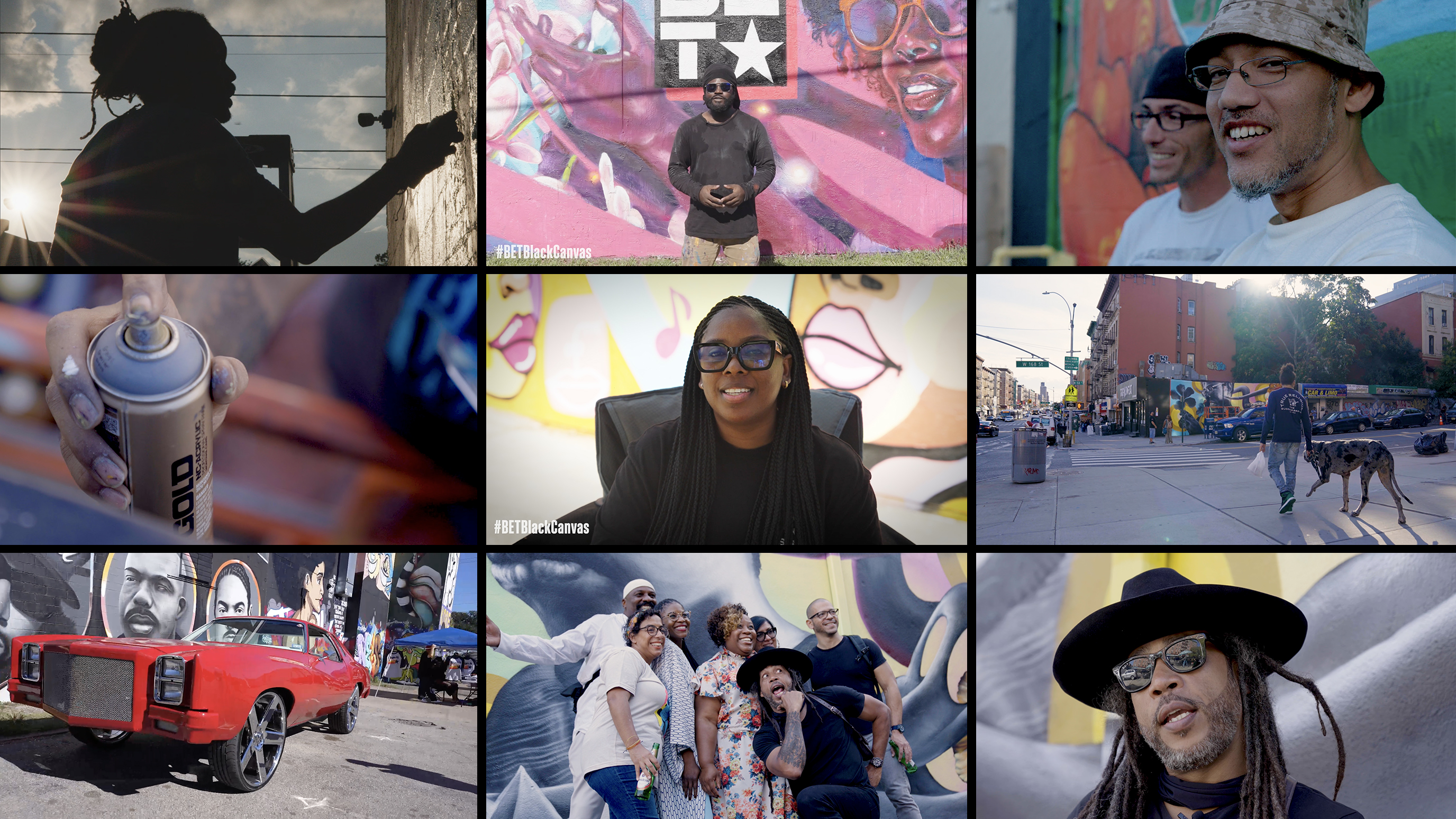
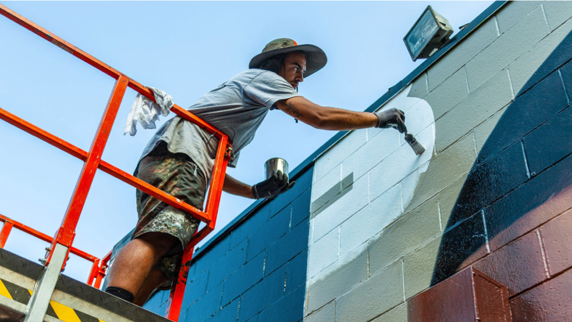
COMMUNITY ACTIVATION
Part of the image campaign was a series of murals, by local artists in major audience enclaves around the country. This is the kind of idea that I have pitched a million times, at the back of creative decks, where you throw out ideas at the client as proof of concept that it has “legs”. Rarely do these ideas ever see the light of day. But not this time. To my delight, BET creatives were determined to make it happen. They reached out to artists all over the country, and let each one choose the destination line that spoke to them. The cut mini docs for each. Here’s just a sampling:
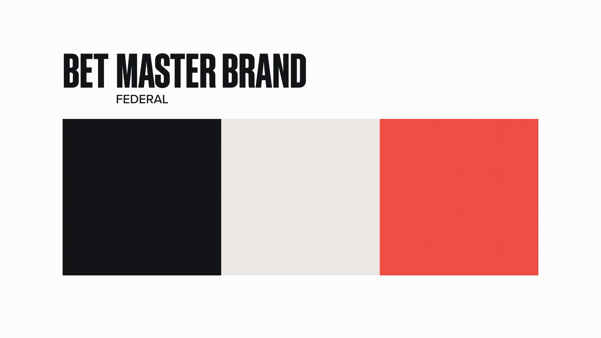
THE MASTER BRAND
The master brand is the foundation for the entire ecosystem. Bold and contemporary, it sets the tone, through the use of a distinct motion behavior. Using the corners of the screen and a highly editorial aesthetic, it feels at once restrained and rebellious. An identity system in a constant state of flux.
We created three additional look & feels, for their three biggest sub-brands. Each had its own style and voice.
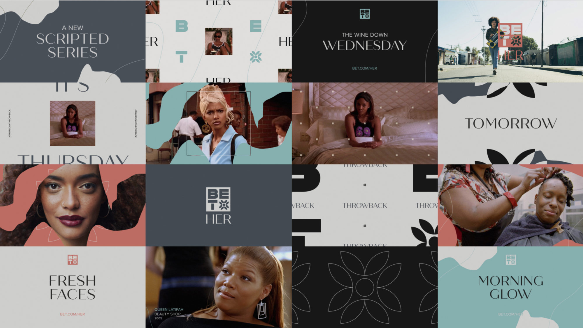
HER
Feminine. Empowered. Sophisticated.
With pastel colors, feminine script, and organic shapes, we wanted to highlight the incredible women in the BET family.

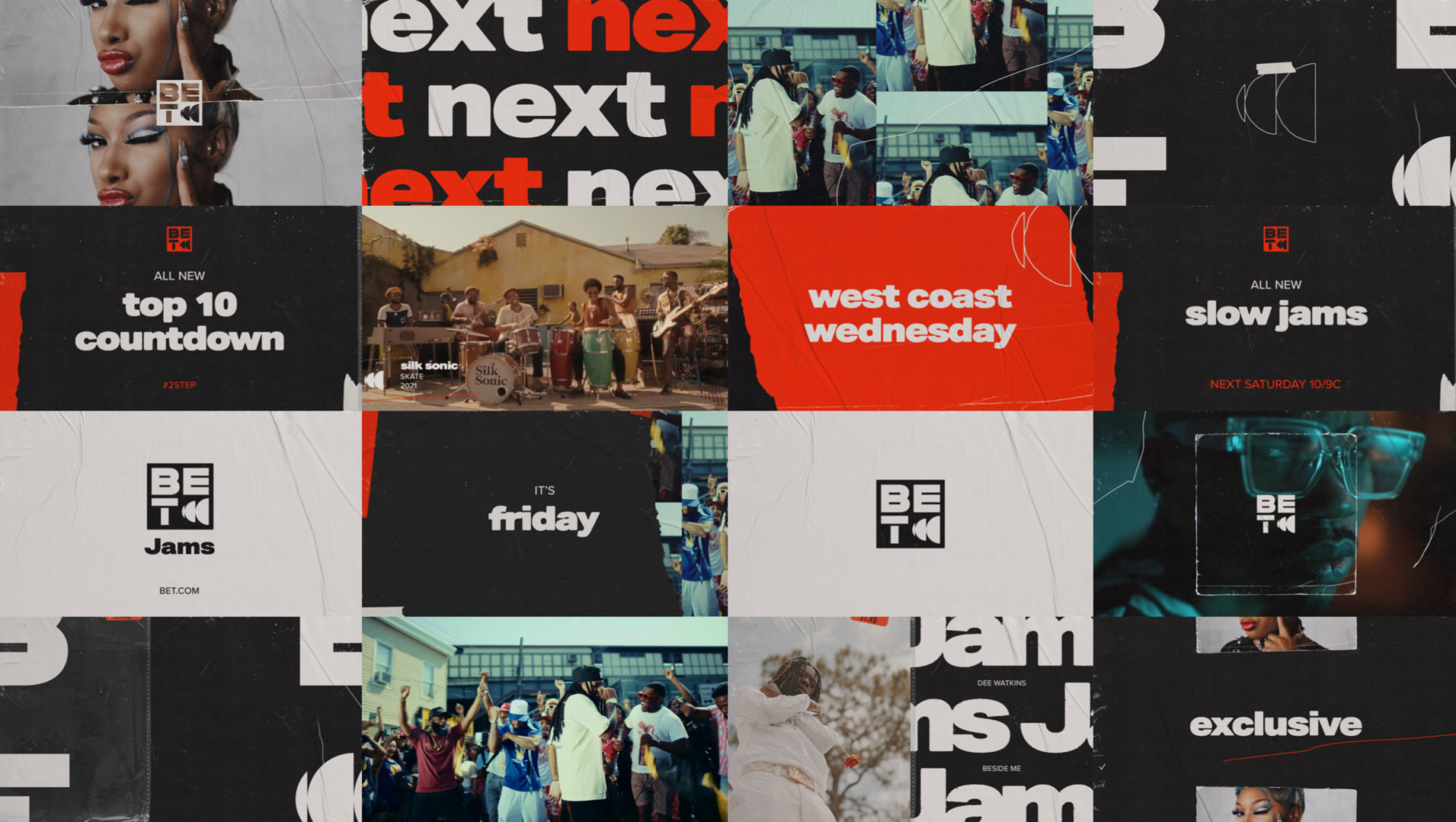
JAMS
Raw. Textured. Bold.
BET Jams takes a page from the aesthetic of tape cassettes, vinyl, and record stores. Raw, textured, and bold it utilizes a vintage collage feel.
SOUL
Expressive. Heartfelt. Deep.
BET Soul has a more refined feel, highly influenced by the world of R&B, and all that comes with its more heartfelt narrative.
Big shout outs to Edwin Santacruz, Lex Ames, Darius Maghen, Larisa Martin, Gustavo Dao, Ben Nichols, Simon Benjamin, and Pamela Olecki – all of whom made great contributions to this project. One last big shout out to the incomparable Rosie Garschina, who shepherded this project through to the end. She has recently transitioned to a CD role at Trollback and I can’t wait to work with her again. Speaking of Trollback…
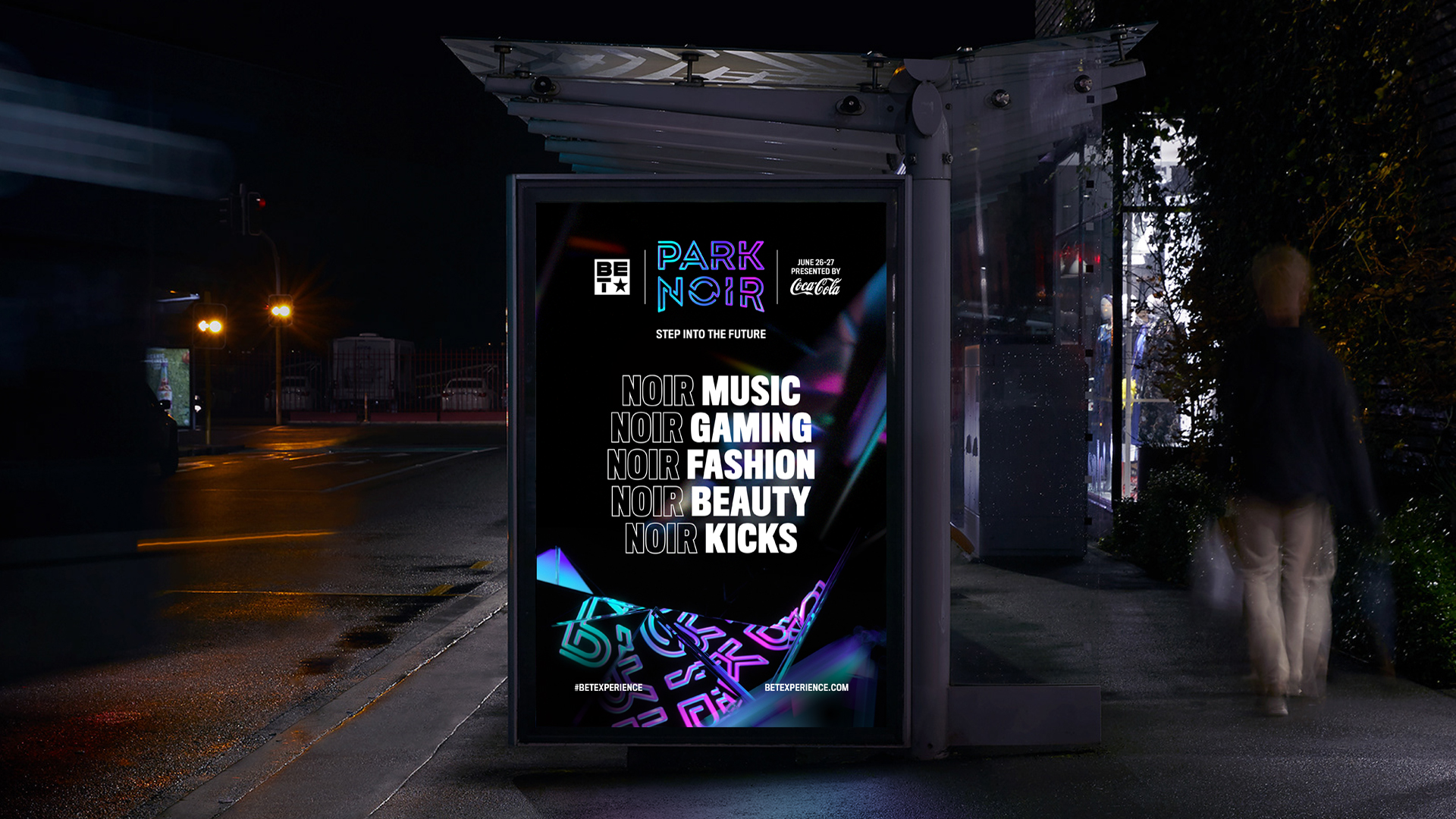
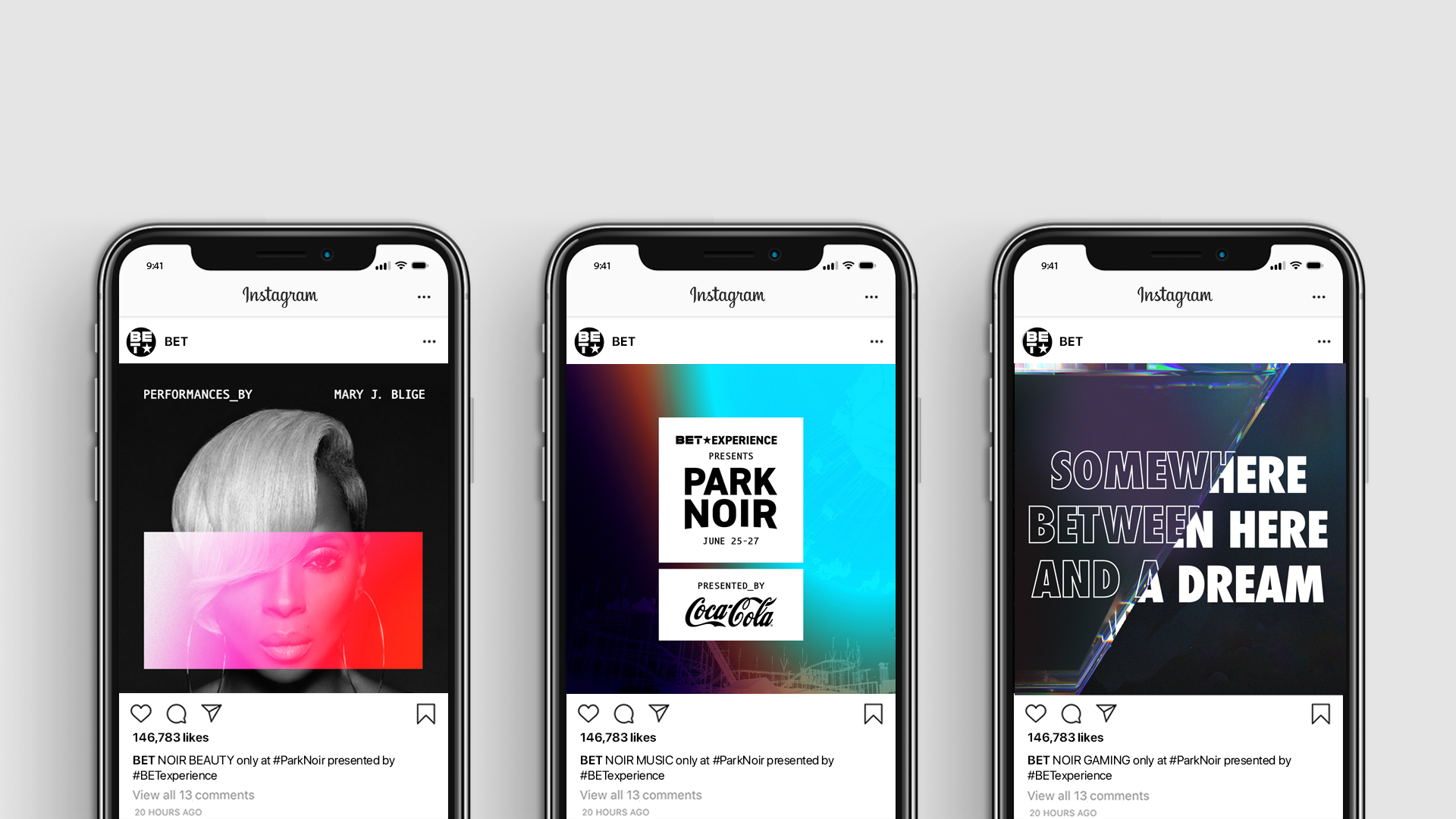
THE BET EXPERIENCE
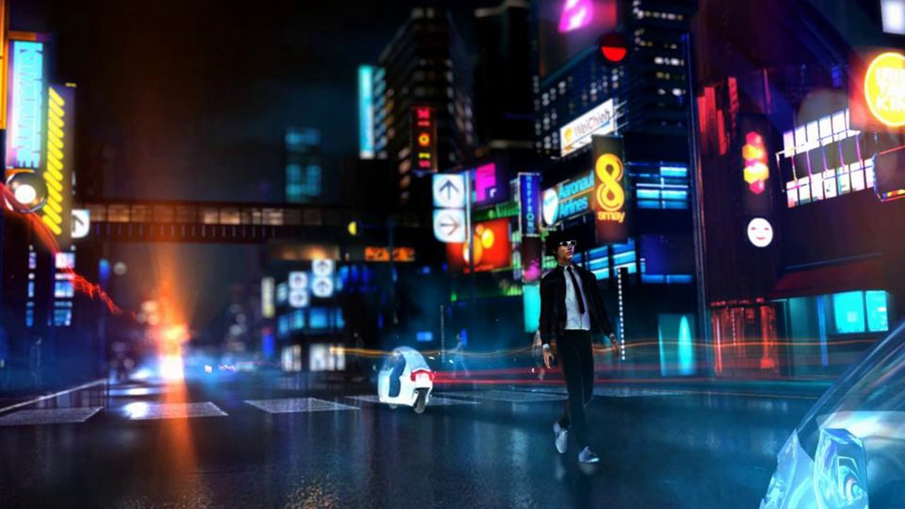
Lastly, with a new logo locked in, we finally had a chance to update the brand identity I helped create for THE BET EXPERIENCE in 2020. This Afro-Futuristic work was done with my peeps at Trollback & Co., with ECD Alex Moulton, Co-CD Elliot Schafer and Art Director Lili Emtiaz. This job began in the Fall of 2019 and continued through the early, rather uncharted months of the pandemic. This being BET’s signature, yearly live event, we were working diligently to create a robust identity that could come alive in animation and be utilized for a host of marketing materials. As you might imagine, the pandemic really took the wind out of ours sails. The live event was cancelled, and pushed to 2021, where it finally took shape as a virtual event. Hopefully in 2022 they can make it happen, in person. Despite these setbacks, it’s still a project I’m super proud of, as Afro Futurism is an aesthetic and ethos I embraced long ago, when I first discovered Sun Ra in my late teens.

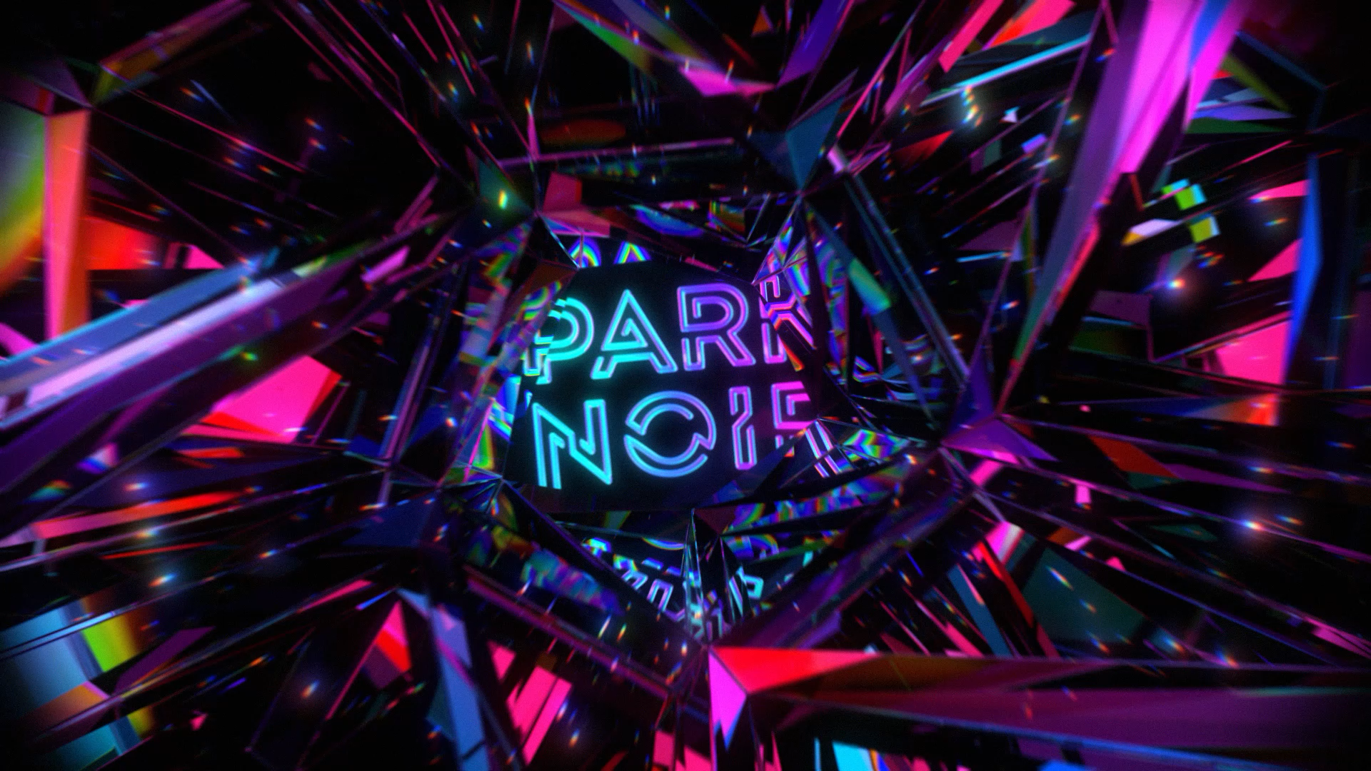
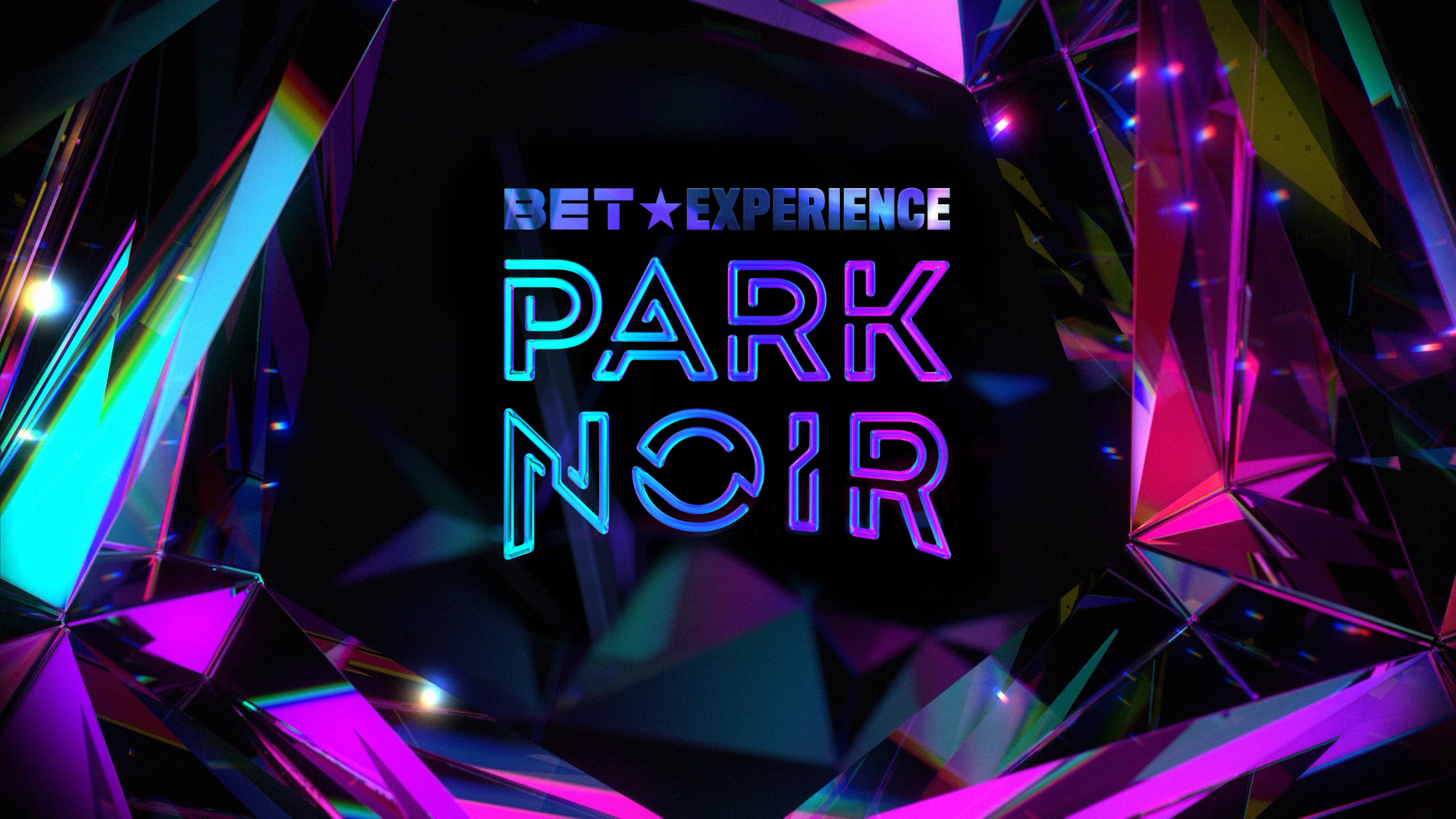
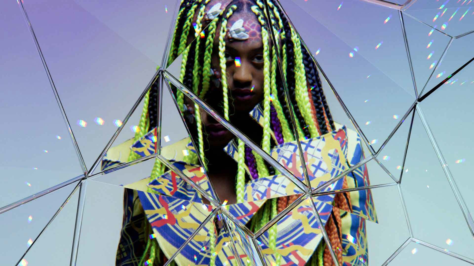
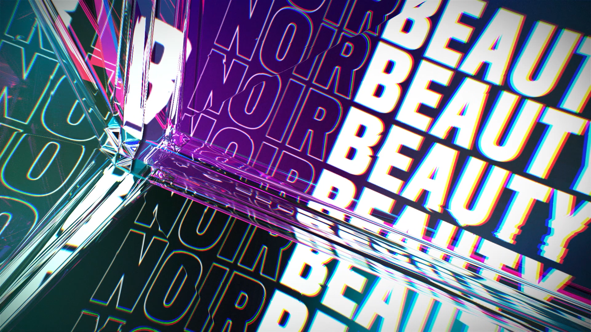
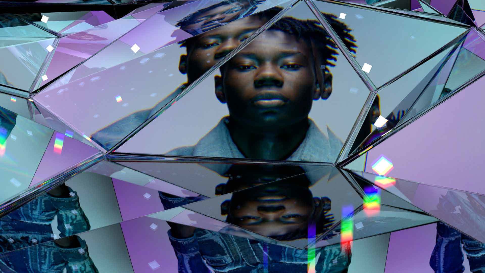
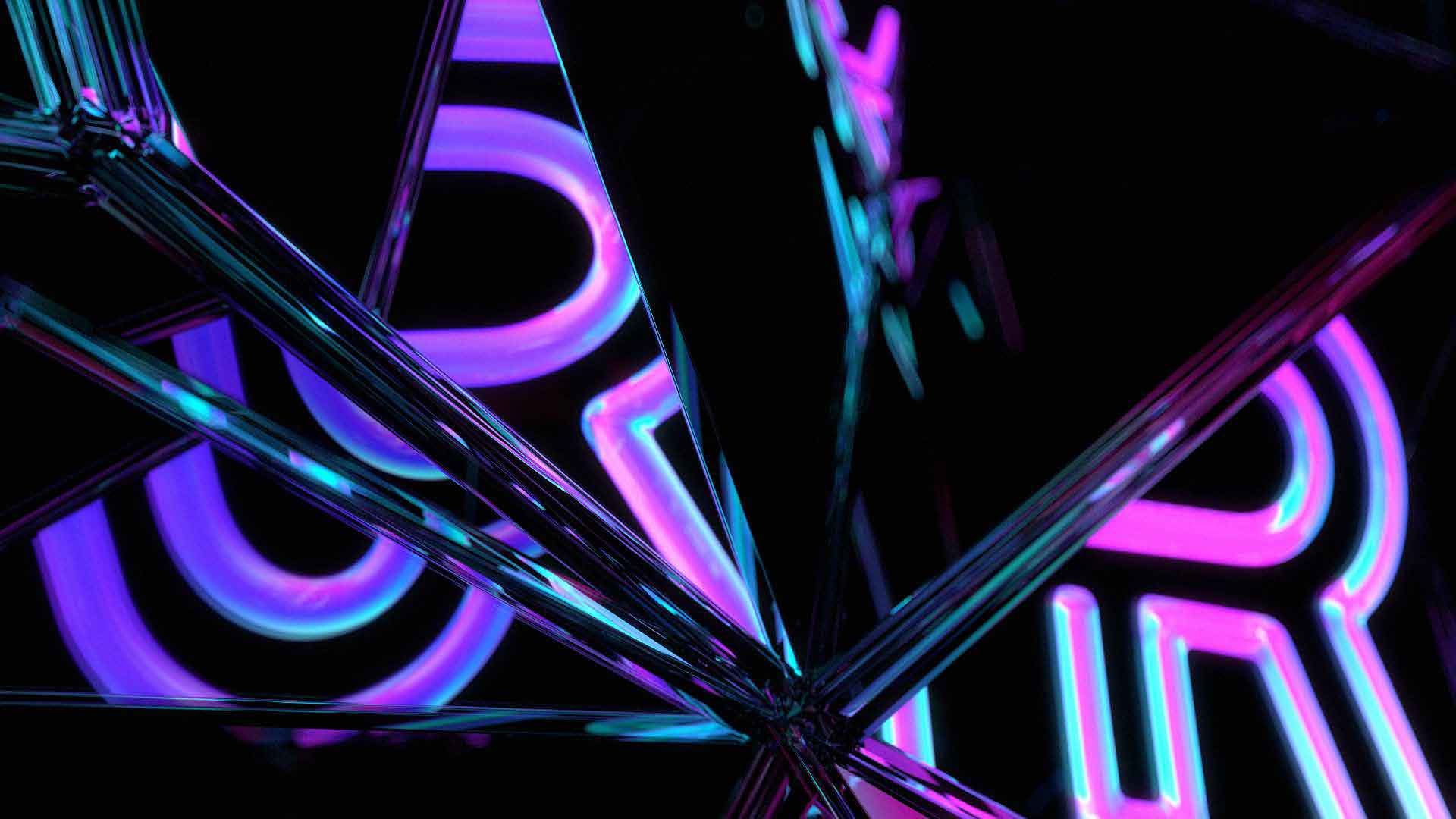
And to give you a quick teaser as to how all of this stuff came alive in motion, this is an early render test – with the old BET logo. The team at Trollback really did an incredible job with the 3D prism textures. Not at easy thing to achieve. Hopefully one day BET gets to use all of this as it was intended.